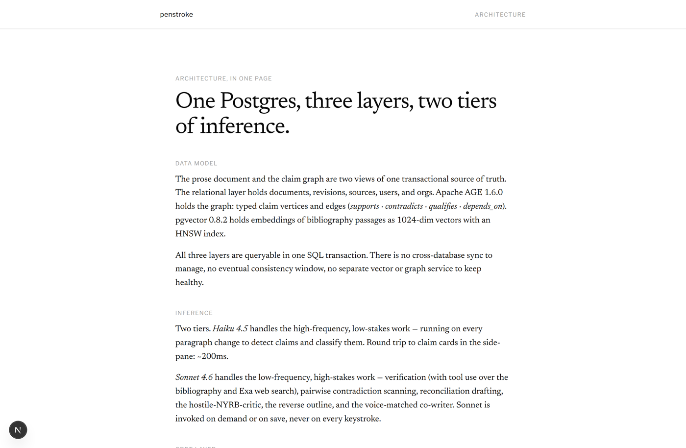
One Postgres holds the relational tables, the Apache AGE claim graph, and the pgvector embeddings, all queryable in a single transaction.
The reading surface a writer gets: prose on the page, the claim it contains already classified in the side pane. The interaction model and the data model are one model.
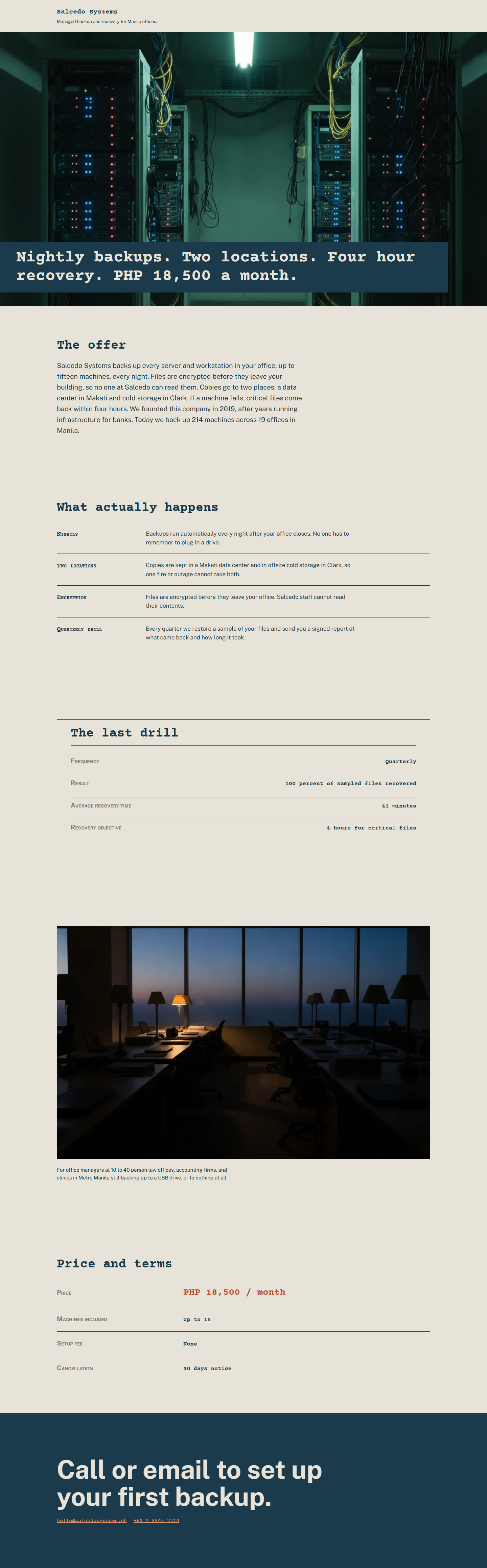
Thirteen deterministic checks grade the rendered page against a versioned rules file, and fail CI if a check stops catching its own defect.
A complete page, art-directed before a line of markup exists: voice, palette, both typefaces, the pricing table, the dusk photograph. The design system is the file the gate reads.
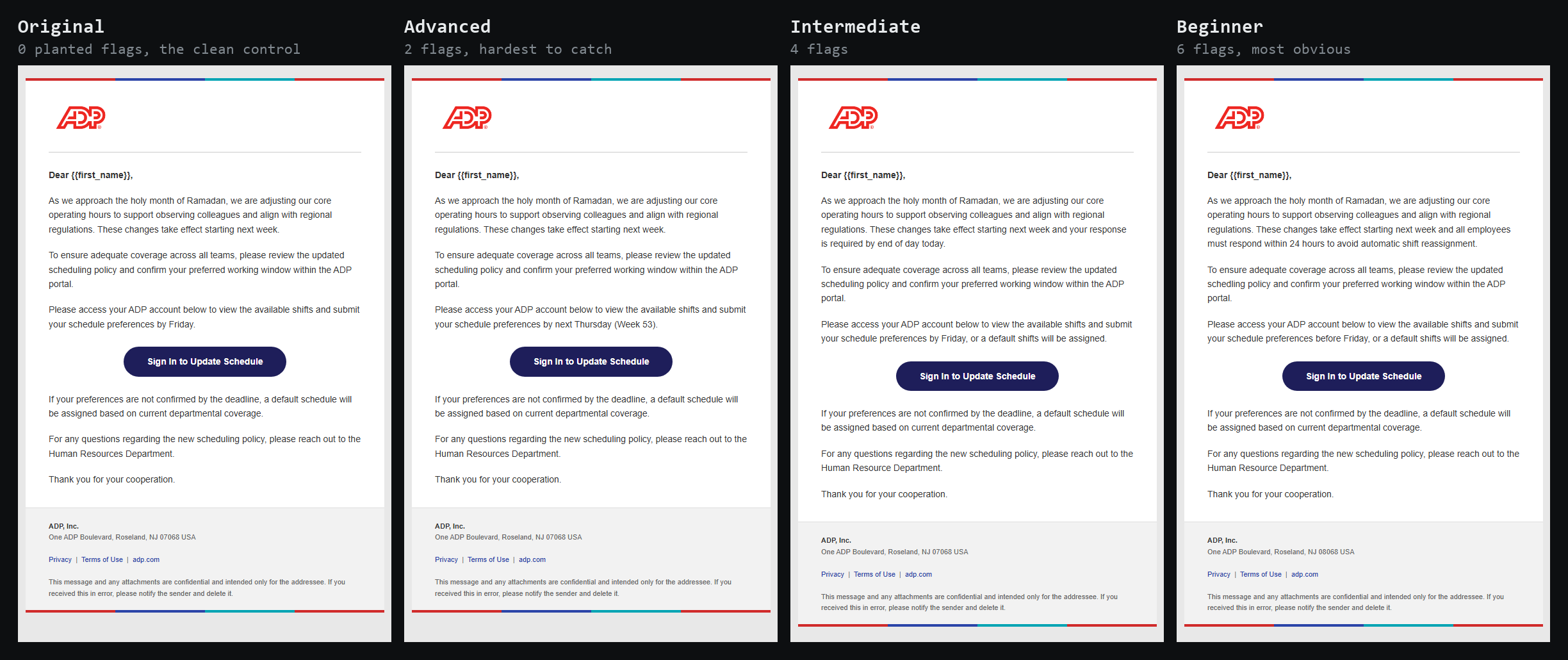
Each tier plants a calibrated number of indicators, scored by an eval so a difficulty band means the same thing in every market.
How obvious a tell reads is a design decision: the type, the spacing, the wording of a fake deadline. Calibrating that across four tiers, roughly 300 times, is the craft.


A hand-built responsive layout, no framework. One accessibility decision worth naming: reduced motion stops the animation but keeps the envelope. The motion goes, the content never does. The full RSVP flow is in the design case study.
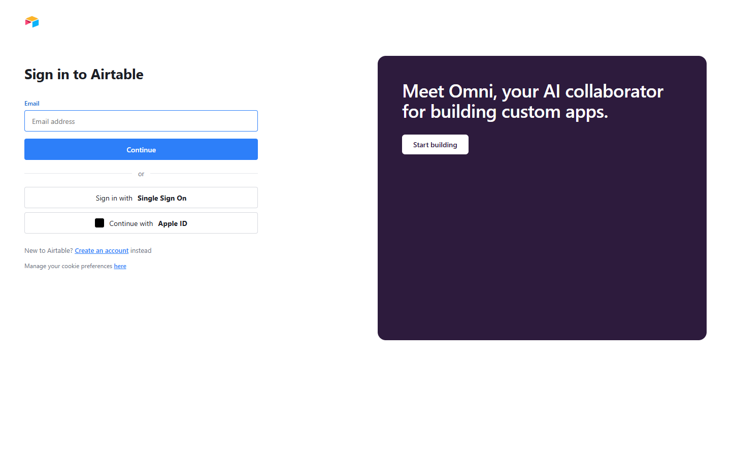
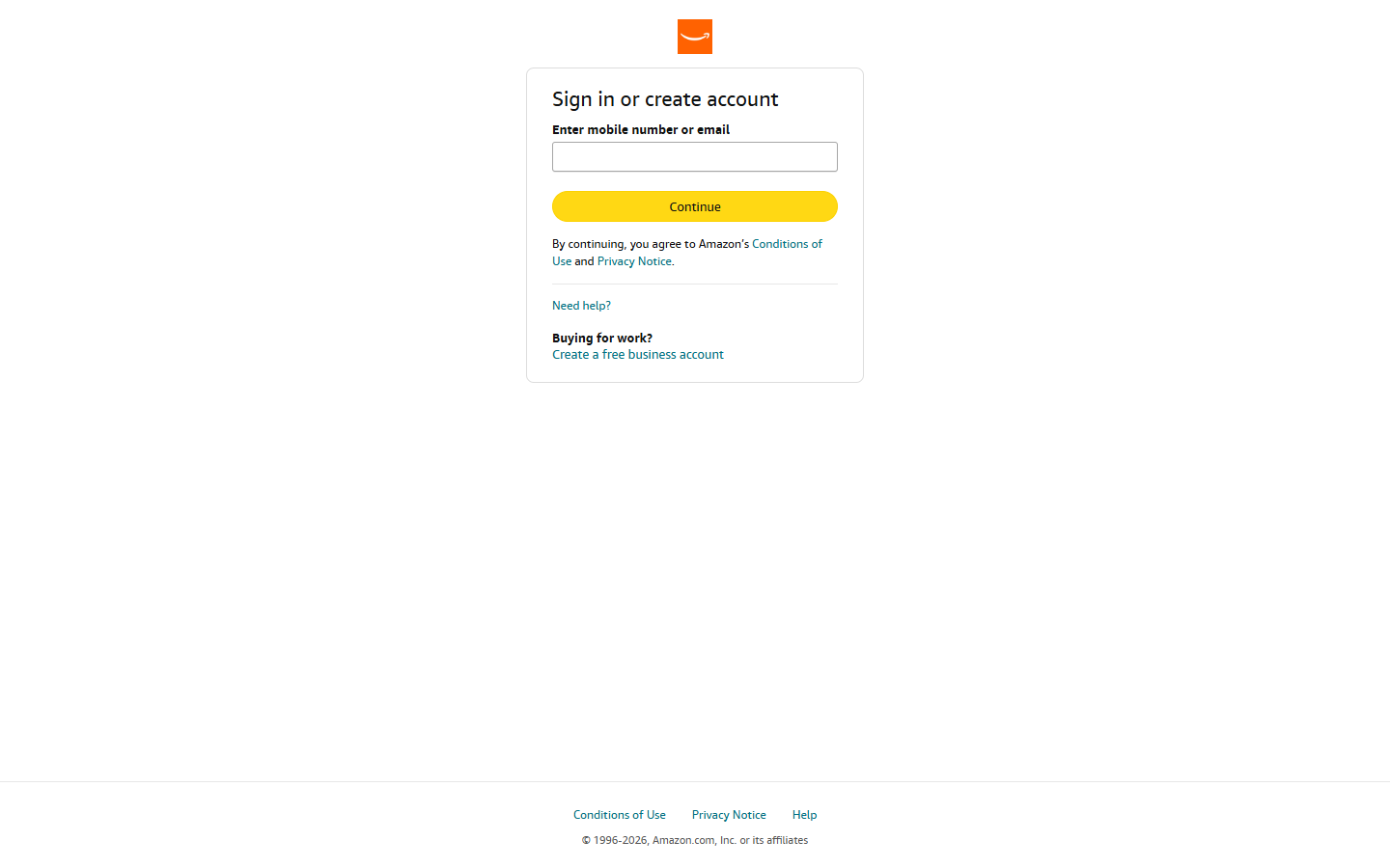
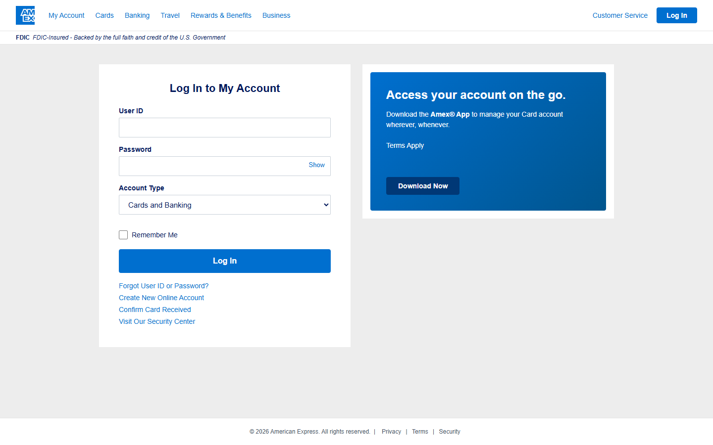
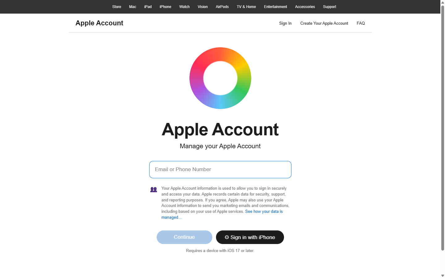
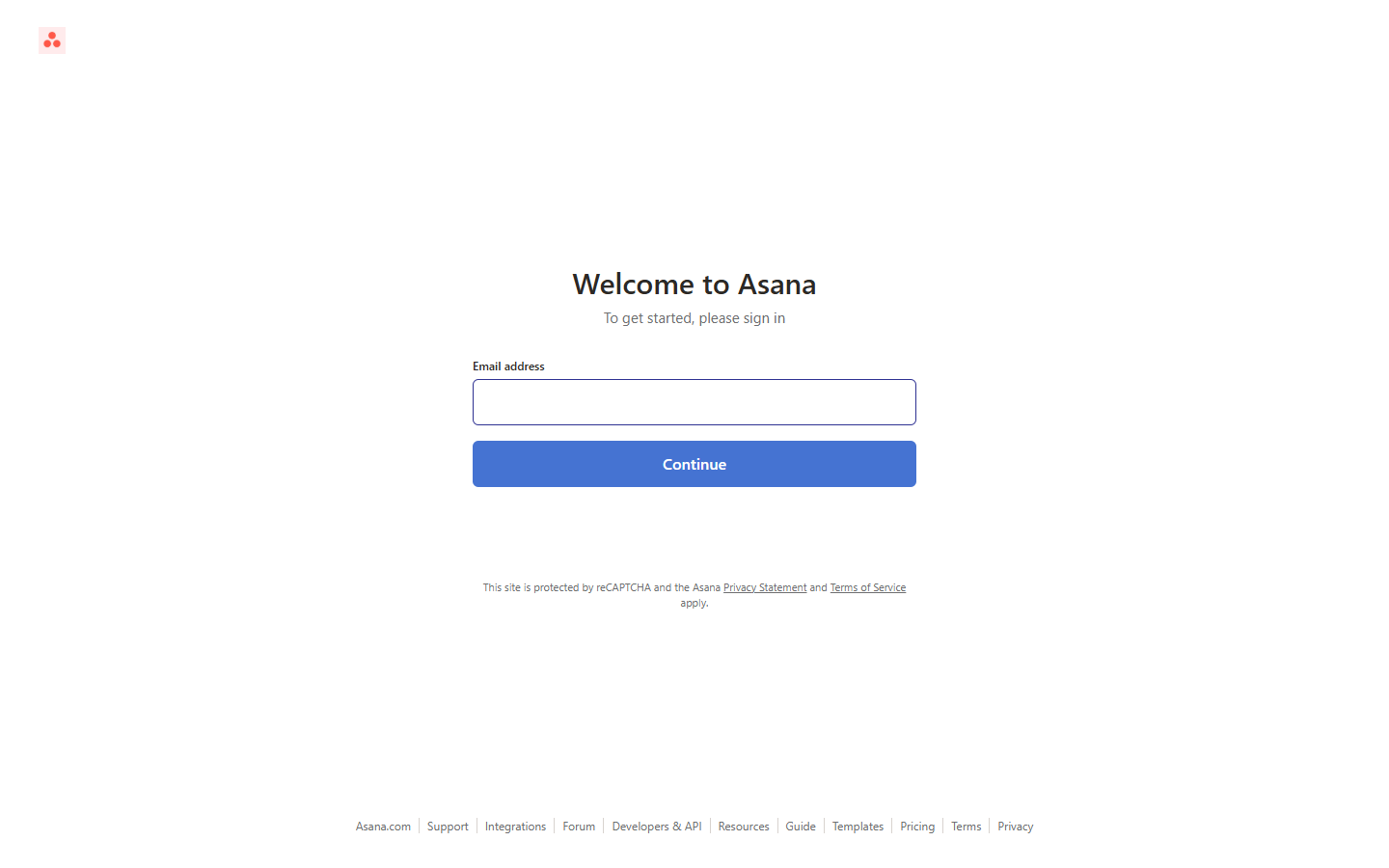
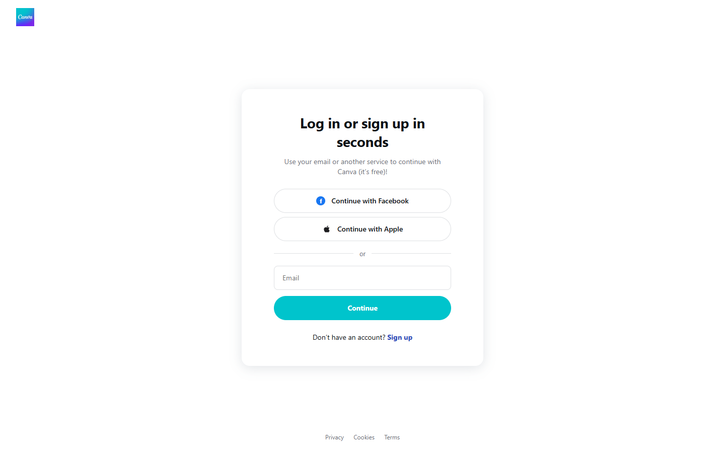
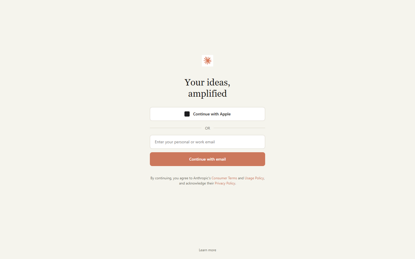
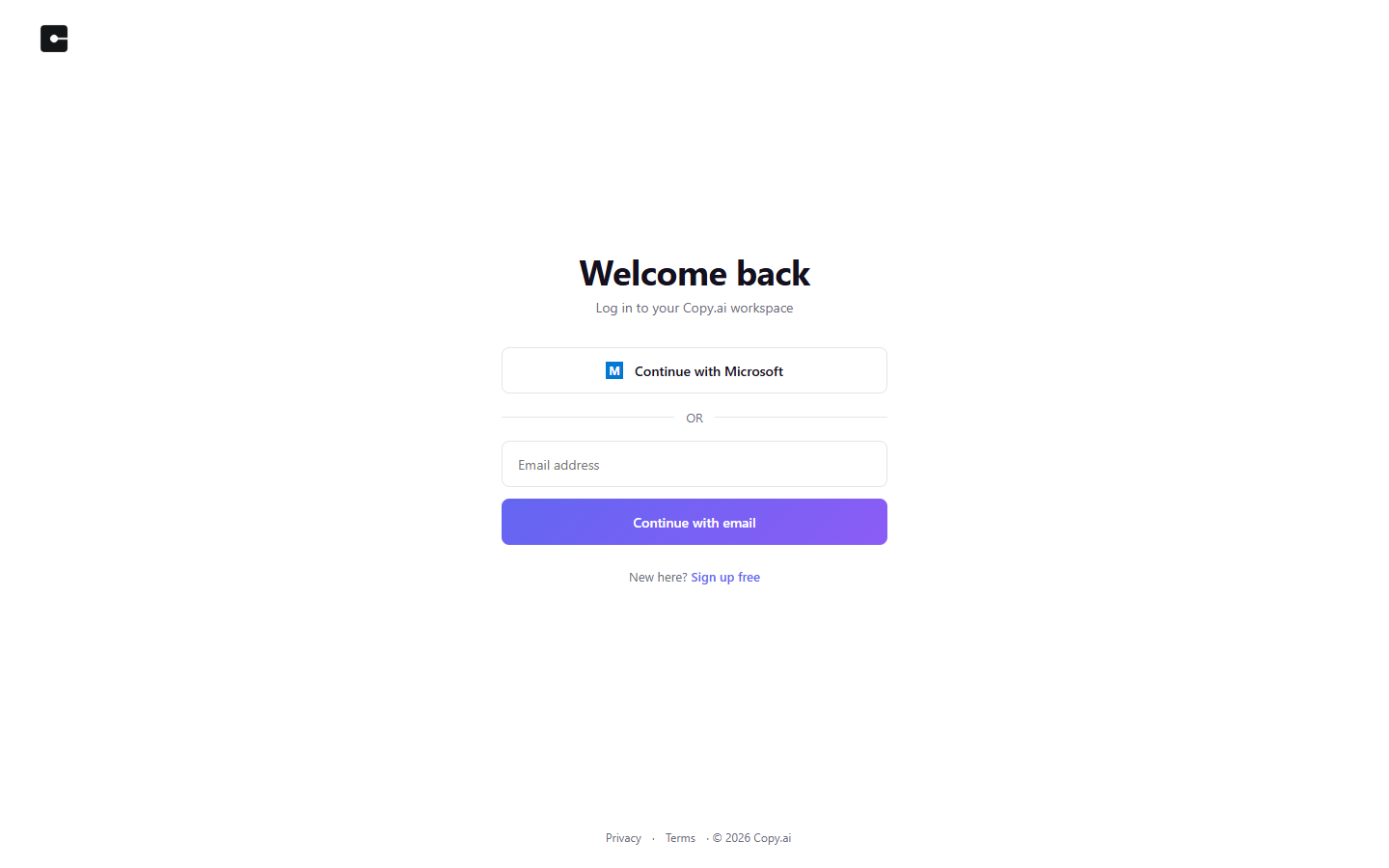
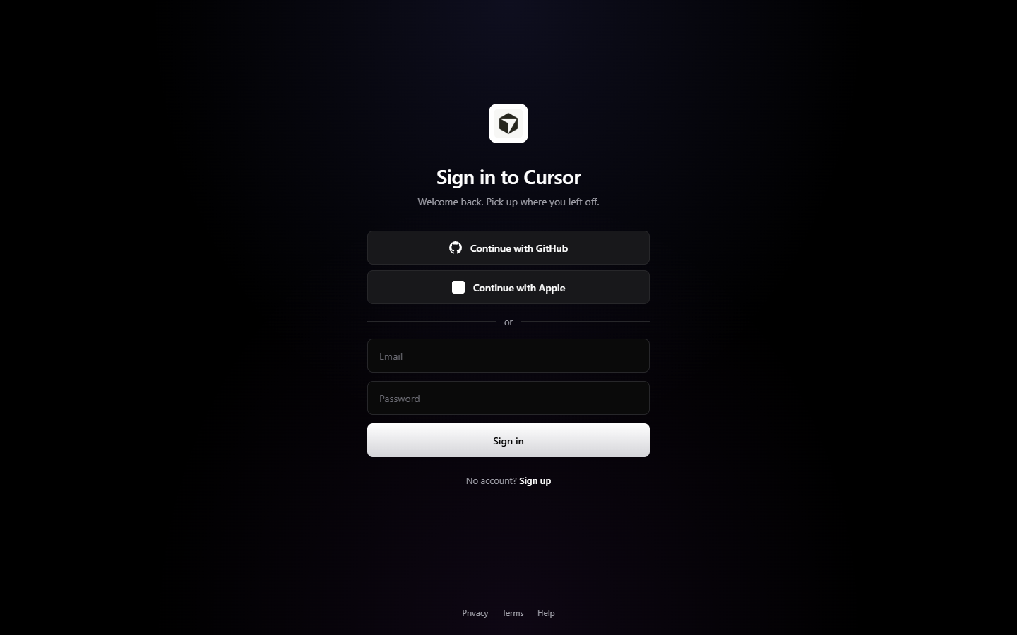
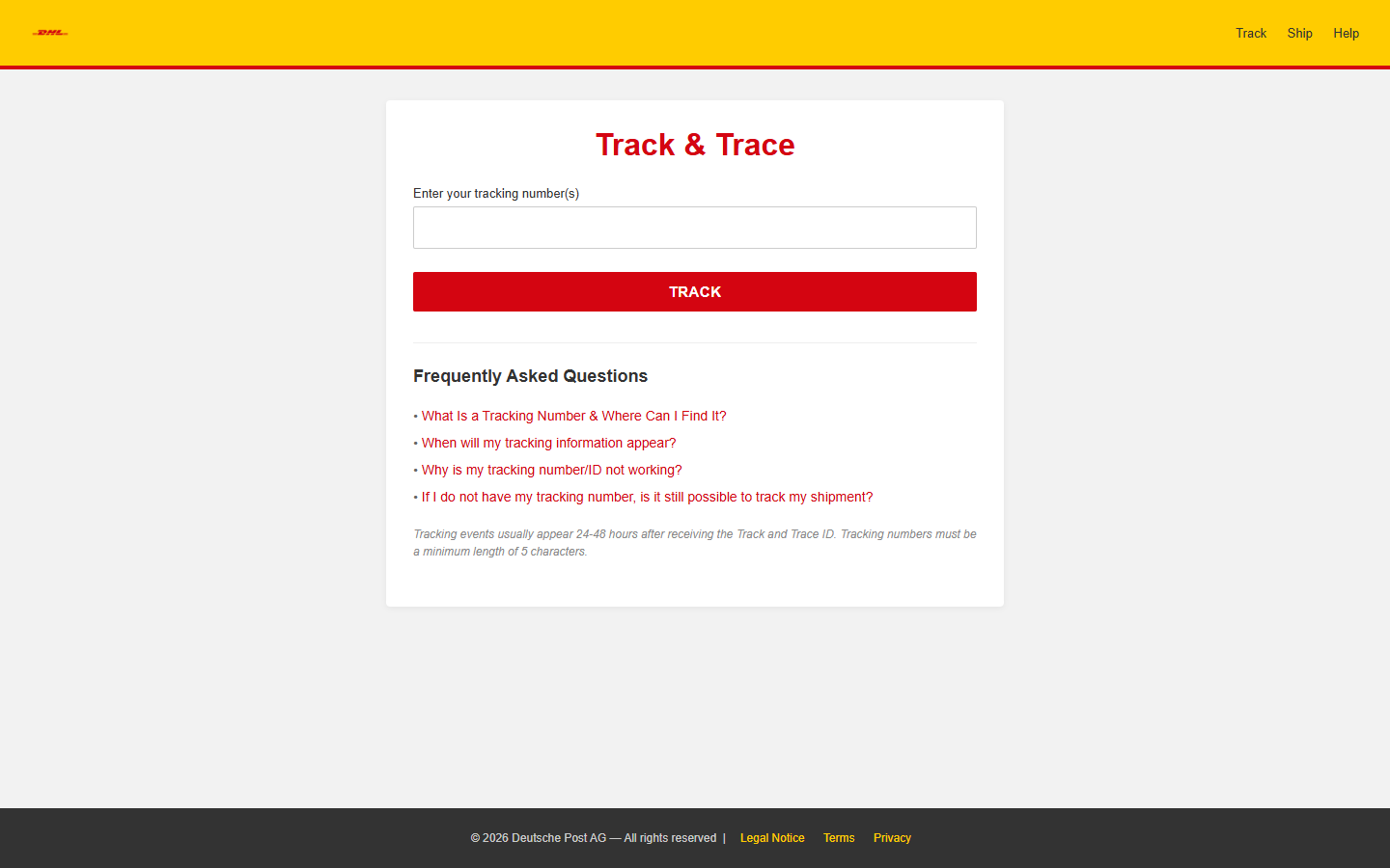
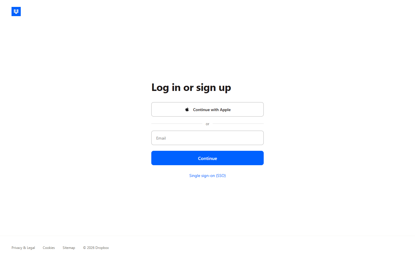
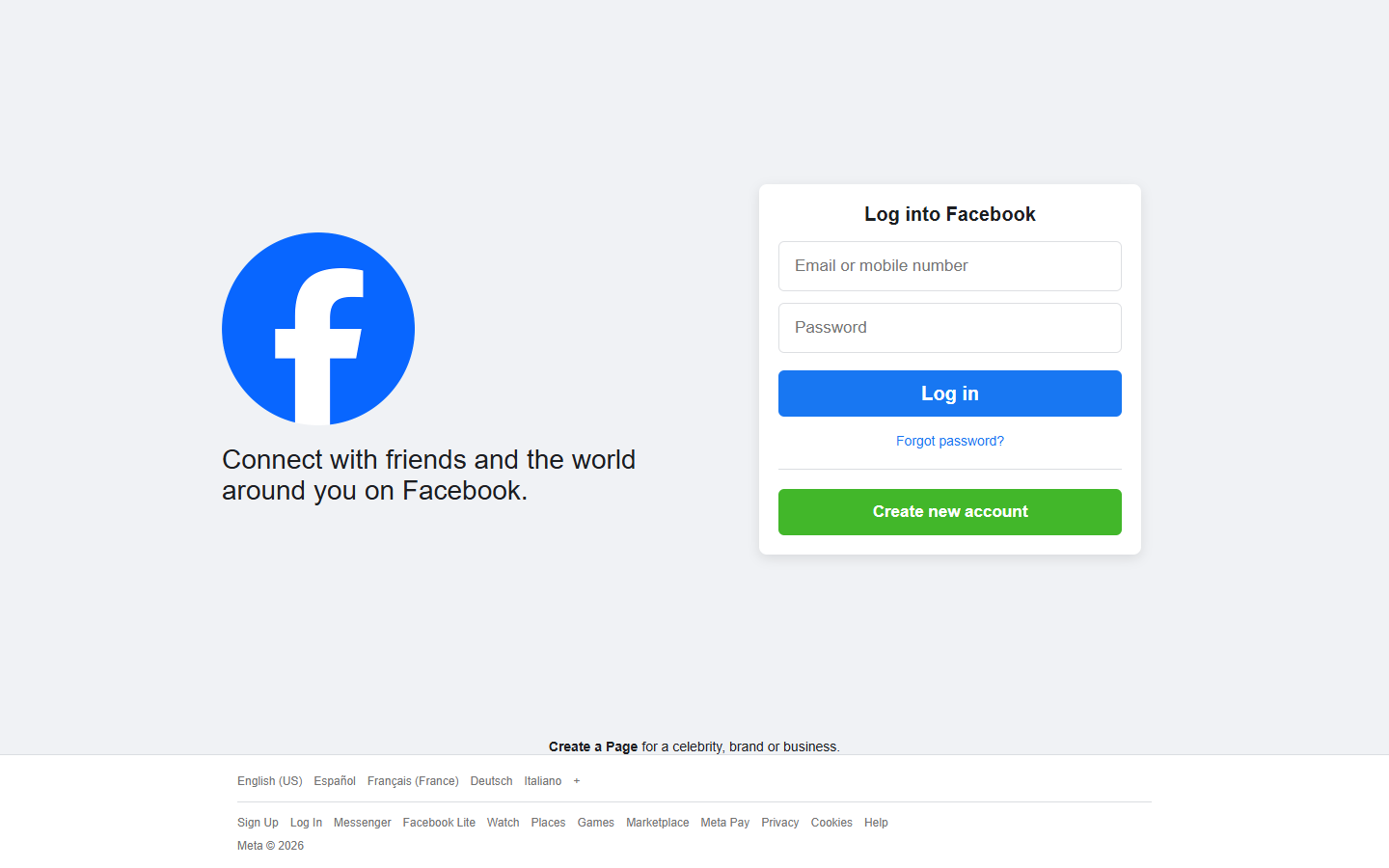
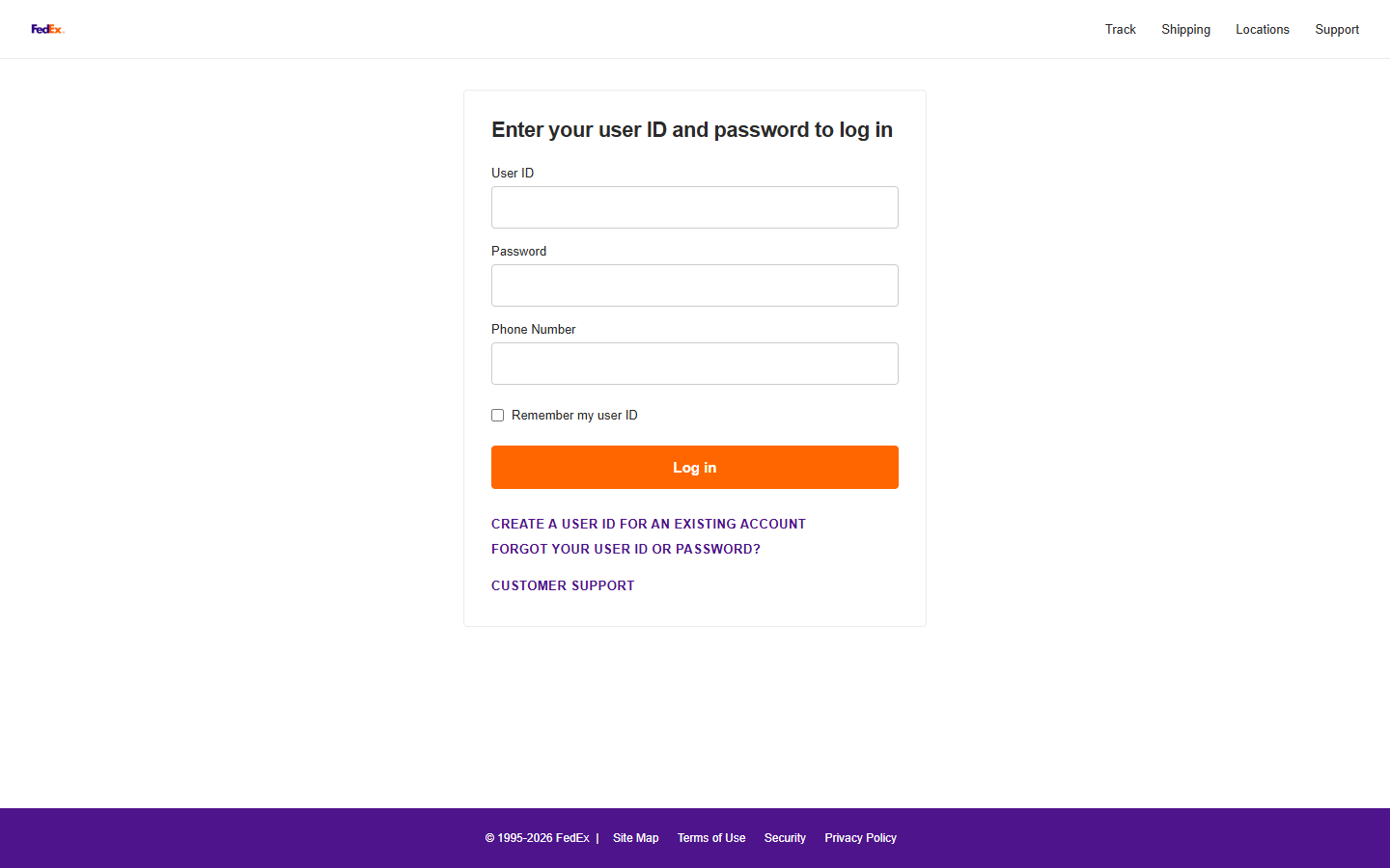
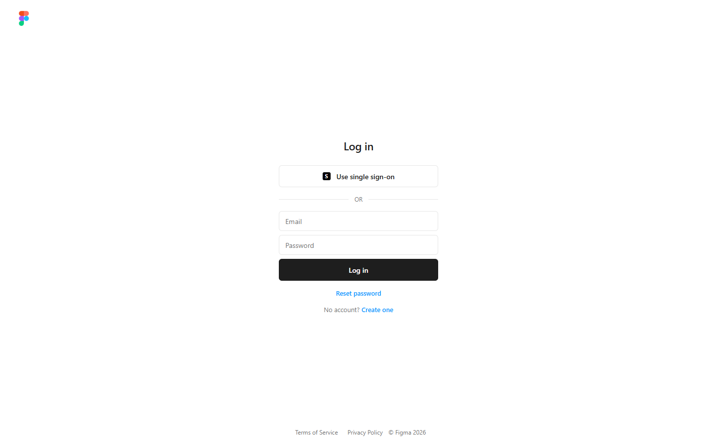
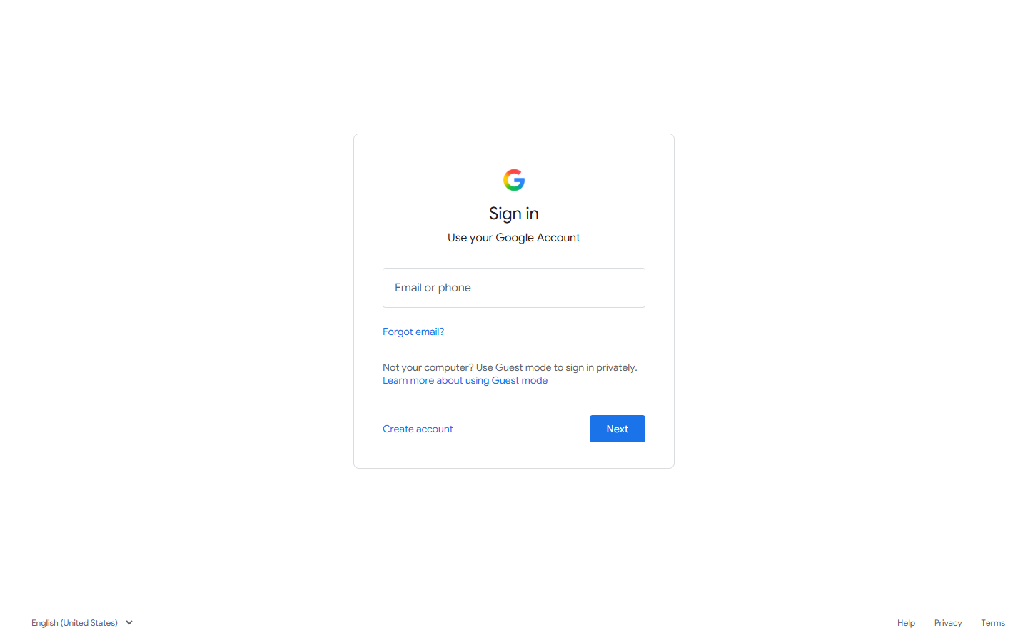
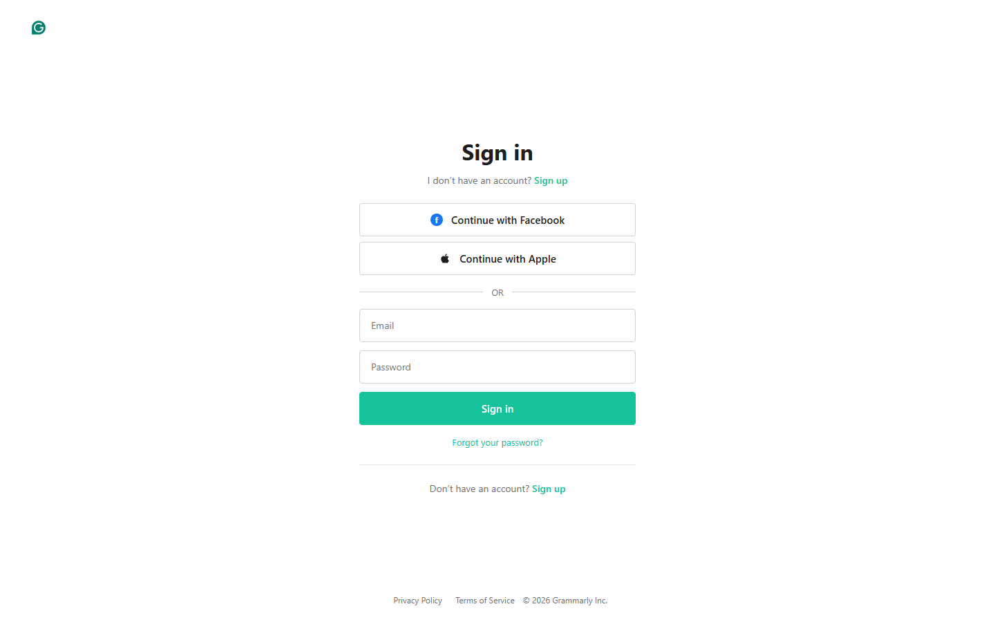
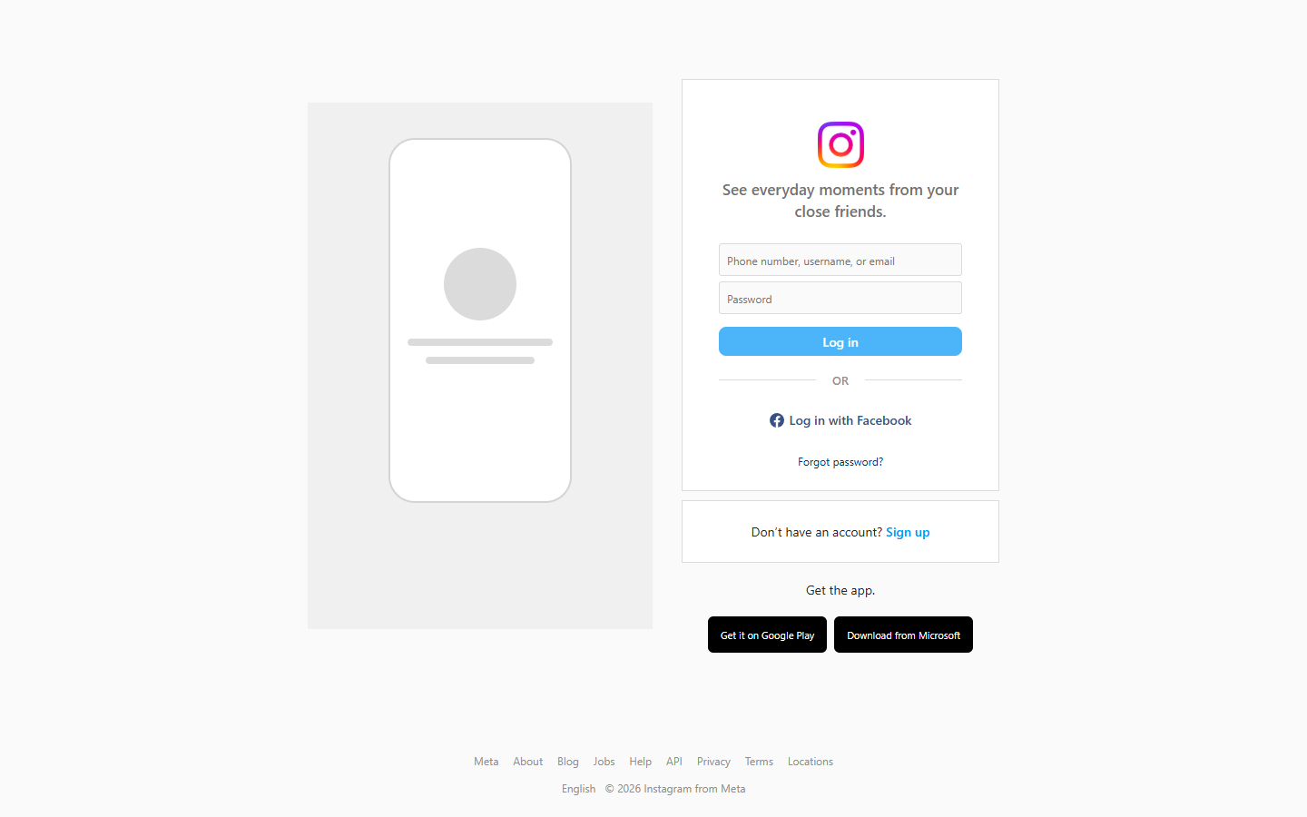
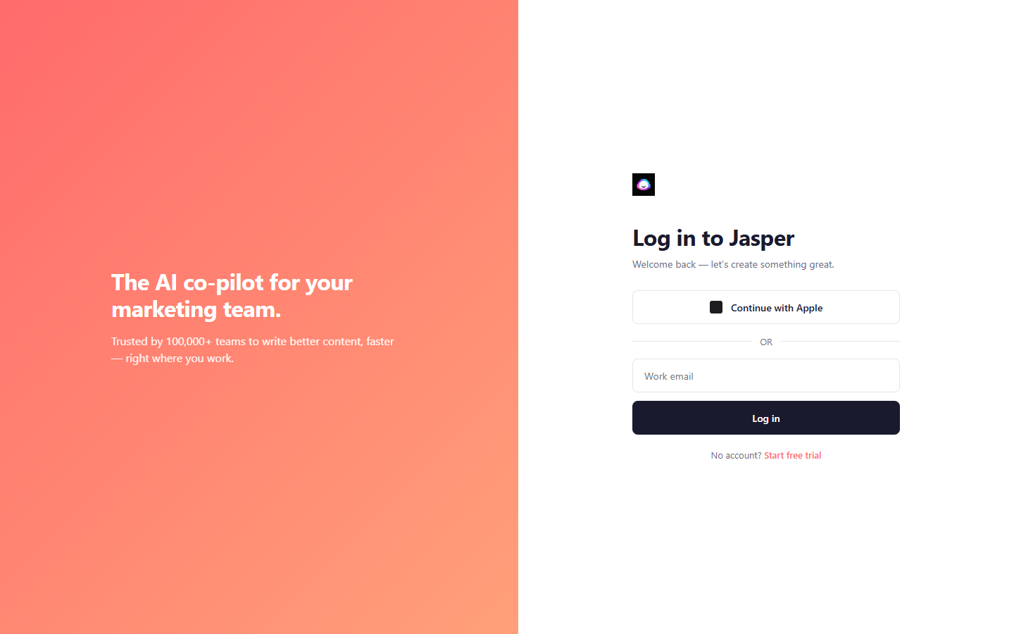
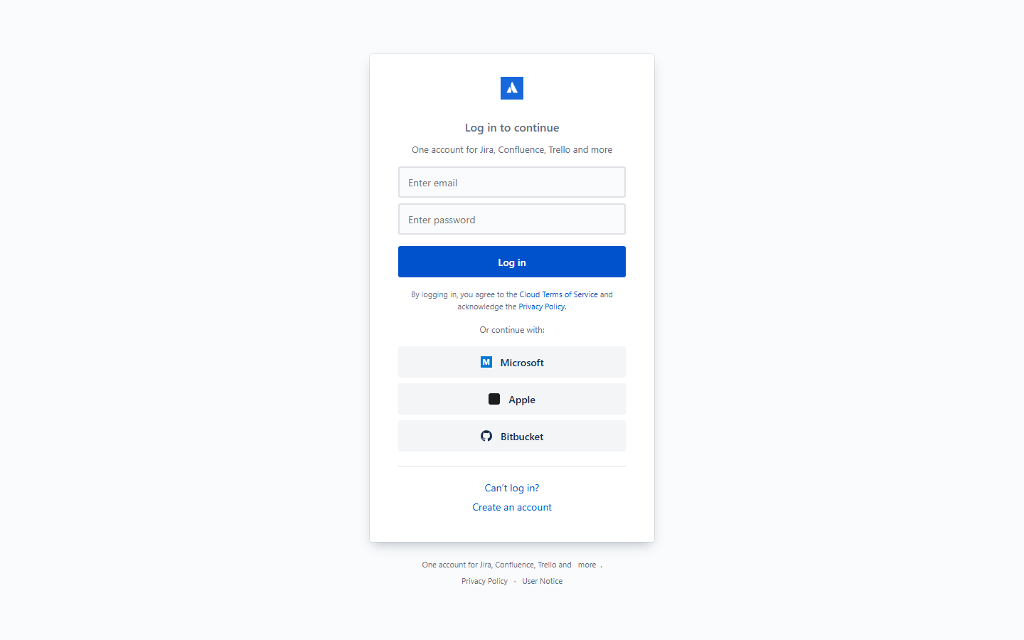
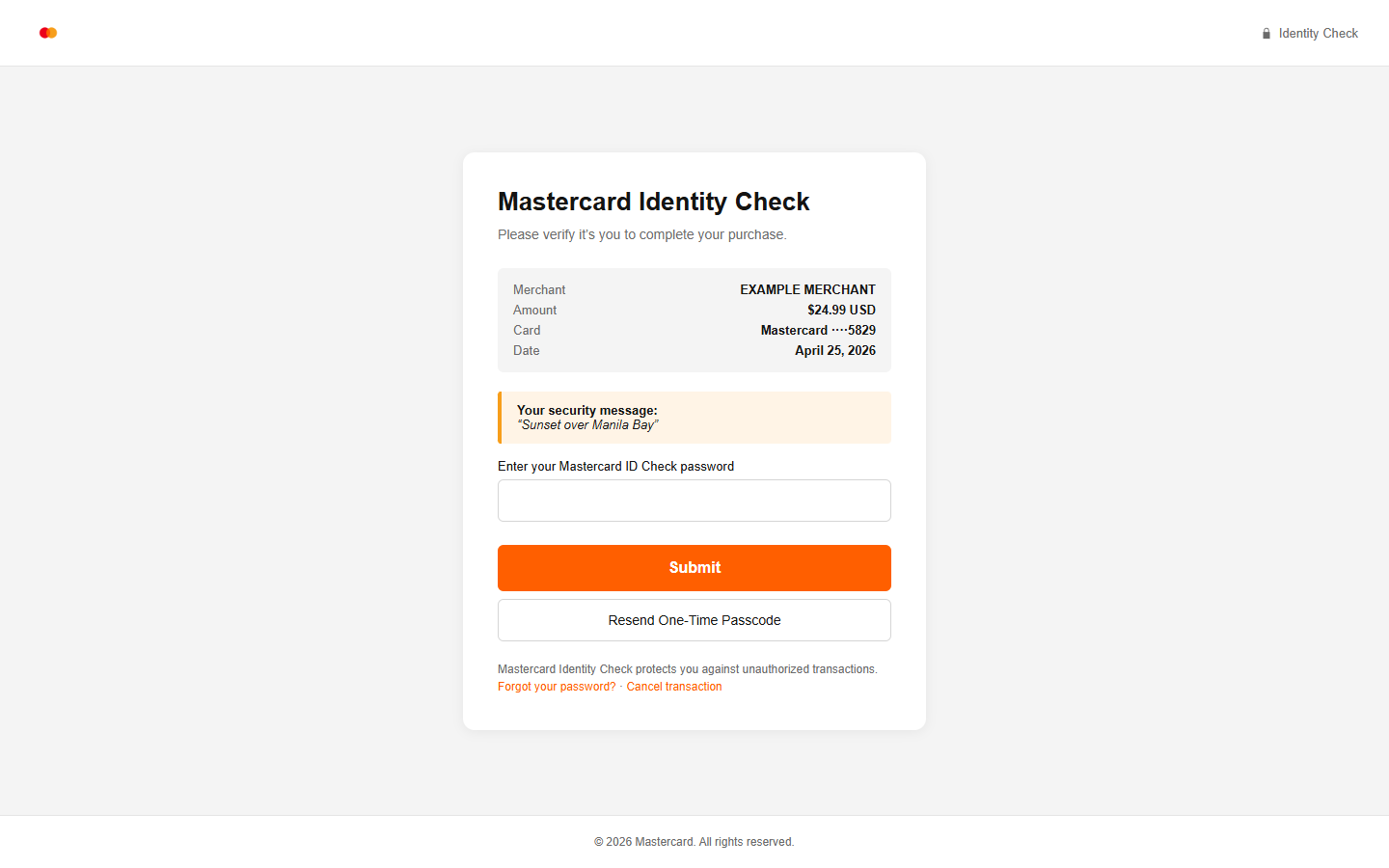
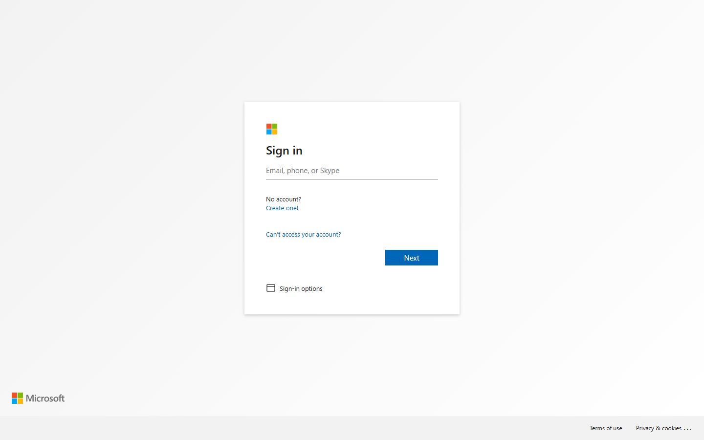
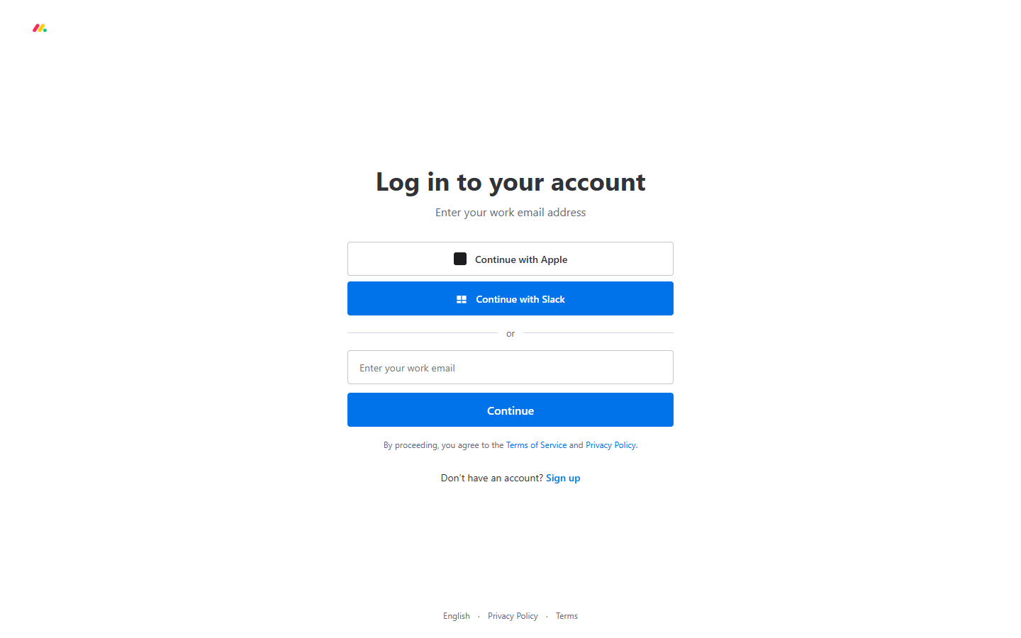
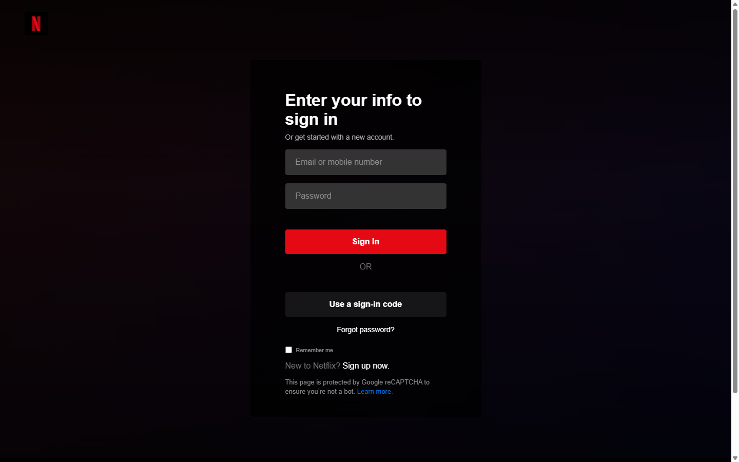
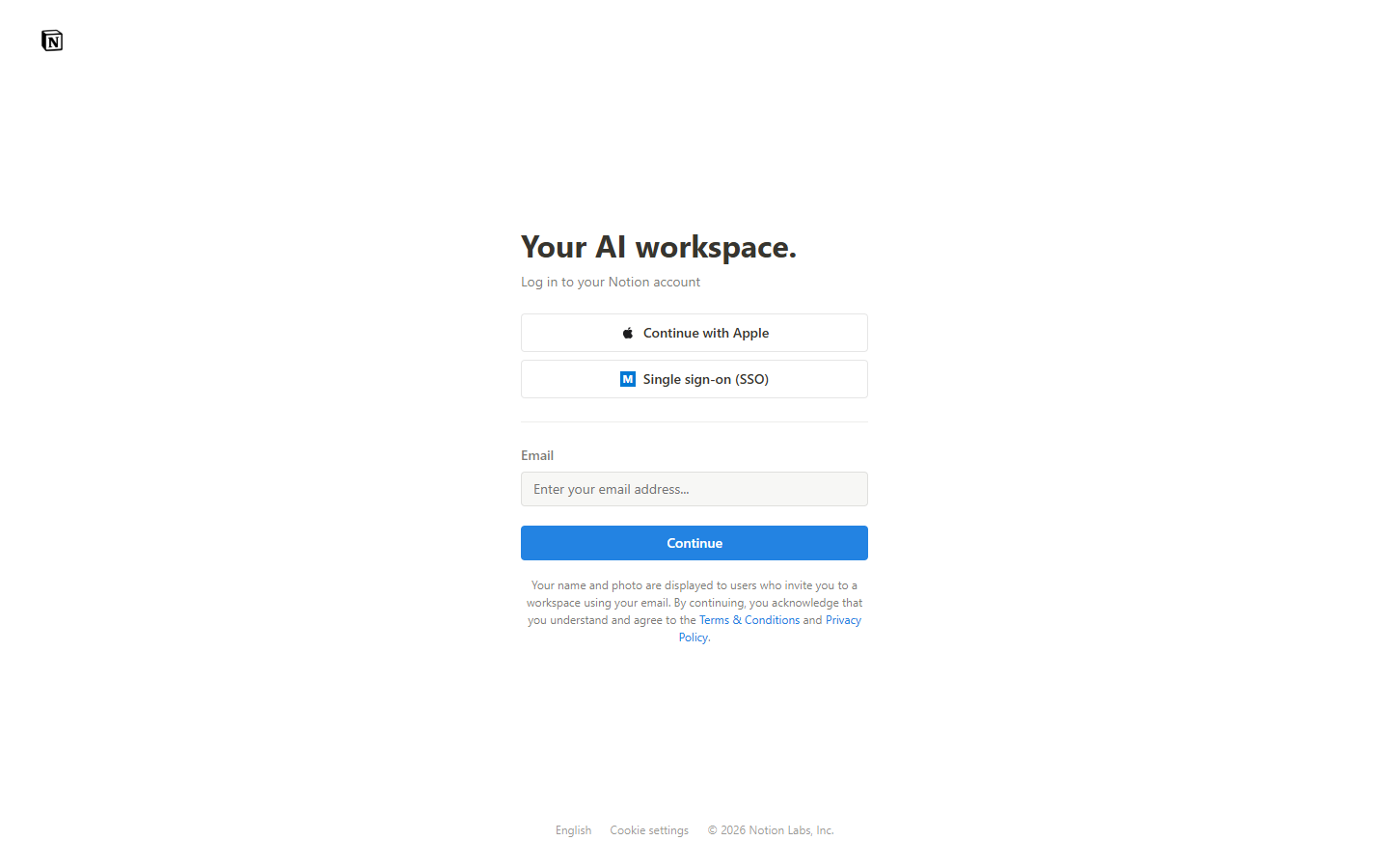
Sign-in and verify pages, each a hand-built vanilla HTML and CSS rebuild to a brand's real house style, used as the click target in an authorized training sim. Consumer brands, banks, SaaS tools. These are screenshots of my rebuilds; the full set and the email lures are in the Cywareness archive.
The shortest version of the argument is the logo. The wordmark ends in a period, and the period is plum, the one color this system reserves for the approve gate. Every automated line on this site ends at a human sign-off, and the name ends the same way. A designer chose that period. An engineer built the gate it stands for. Newsreader at weight 500, shaped to real vector paths, single-color survivable, and the spec forbids plum on the ink ground because it fails contrast: a brand rule and a contrast rule written as one line.
The loop is short because one person runs both ends. A screen starts in Figma, becomes component code, and then the same person wires that component to a model call, an eval, or a guardrail. Vellum's editor is a Next.js surface over a Tiptap schema, and the sentence you type reaches a Haiku classifier in roughly 200ms. Alagà's reply sits on a TypeScript agent written directly on the Messages API. This site is hand-authored: the fleet map on the homepage is a runtime-computed SVG, and the status line fetches live from the agent fleet on fly.io.
The stack is the one on the about page: Python and TypeScript, Claude and OpenAI over MCP, LangGraph, n8n, and pgvector, with Claude Code as the daily driver. Because the design and the model are built by the same person, neither is a black box to the other. A slow model call is a layout problem I can see coming, and a confusing screen is often a prompt I can fix.
design.html is the pure design work: five sites designed and built end to end, and the written UX studies behind them.
all.html is the full index of agents, MCP servers, and evals, each with its evidence rendered on the page.