Maria Angelika Agutaya  ·  case study Shoshana Ambani Plastic Surgery, 2026

A plastic surgery practice that publishes its prices

ClientShoshana Ambani Plastic Surgery, Ann Arbor, Michigan My partUX and UI design StatusLive at shoshanamd.com Companion pieceThe Figma systemization case study
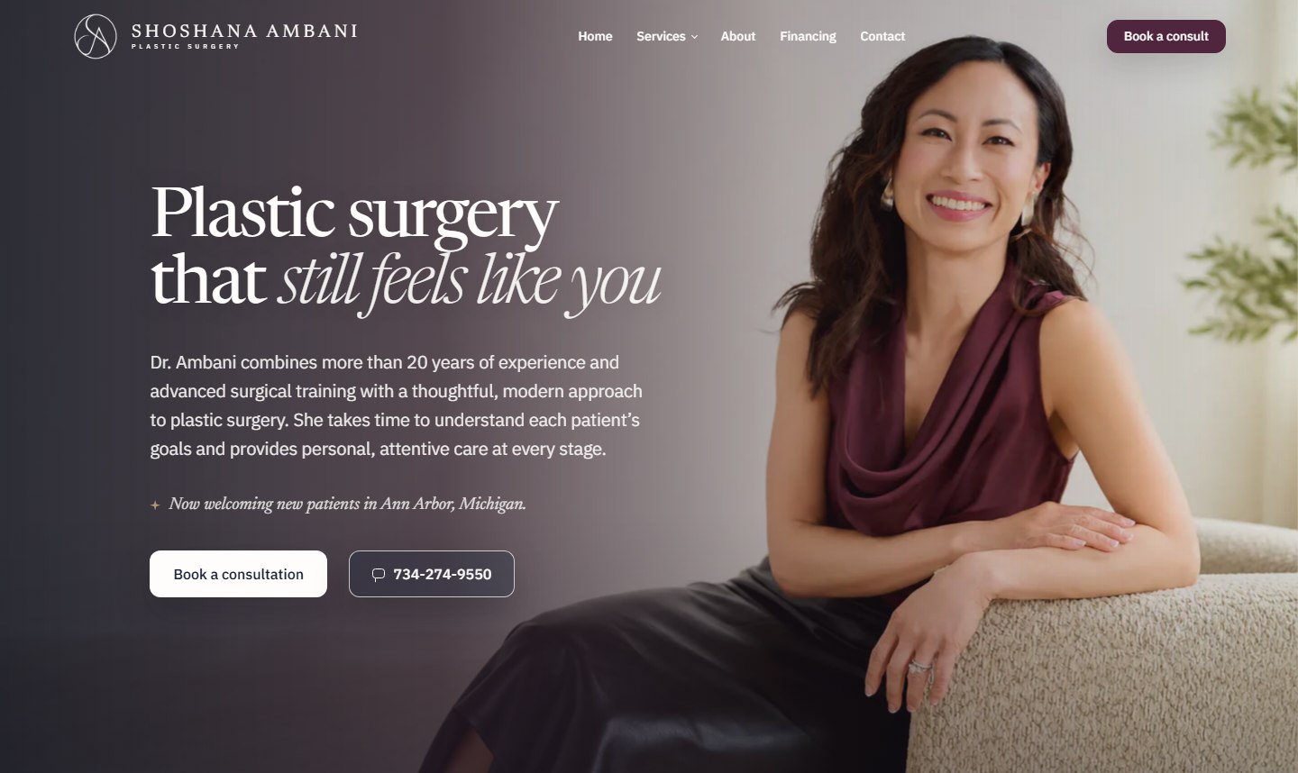
The live shoshanamd.com homepage hero: Plastic surgery that still feels like you, over a warm photograph of Dr. Ambani in her practice

The problem: people research surgeons for months, on sites that hide prices and sell transformation.

What I designed: a 12-template practice site built on the opposite bet: published costs, one action, honest fine print.

The result: live at shoshanamd.com, average costs from $1,000 to $22,000 in the open, every page ending at the same consultation.

The visitor is scared, and has been Googling for weeks

Nobody impulse-buys surgery. By the time someone reaches this site they have compared surgeons, read horror stories, and rehearsed the question they are embarrassed to ask: what will it cost, and will I still look like me? The design answers both before the first phone call. The thesis is the first line on the site:

“Plastic surgery that still feels like you.”

Why recognition beats transformation

Aesthetic surgery marketing defaults to selling a new person. That framing feeds the visitor's exact fear, that they will come out looking done. Every design decision below runs the other way: the site photographs the surgeon as a person and the practice as a place, states limits as plainly as promises, and treats the reader as someone making a careful medical decision rather than shopping a glow-up. The practice is self-pay and consultation-based, which makes the honesty affordable: the site's job is not to close a sale, it is to start the right conversation.

Audience
Adults planning elective surgery, and reconstruction patients arriving after a diagnosis
Setting
Self-pay concierge practice; consultations are the product
Surfaces
12 page templates, 30+ procedures in four families

Decision one

Put the price table on the website

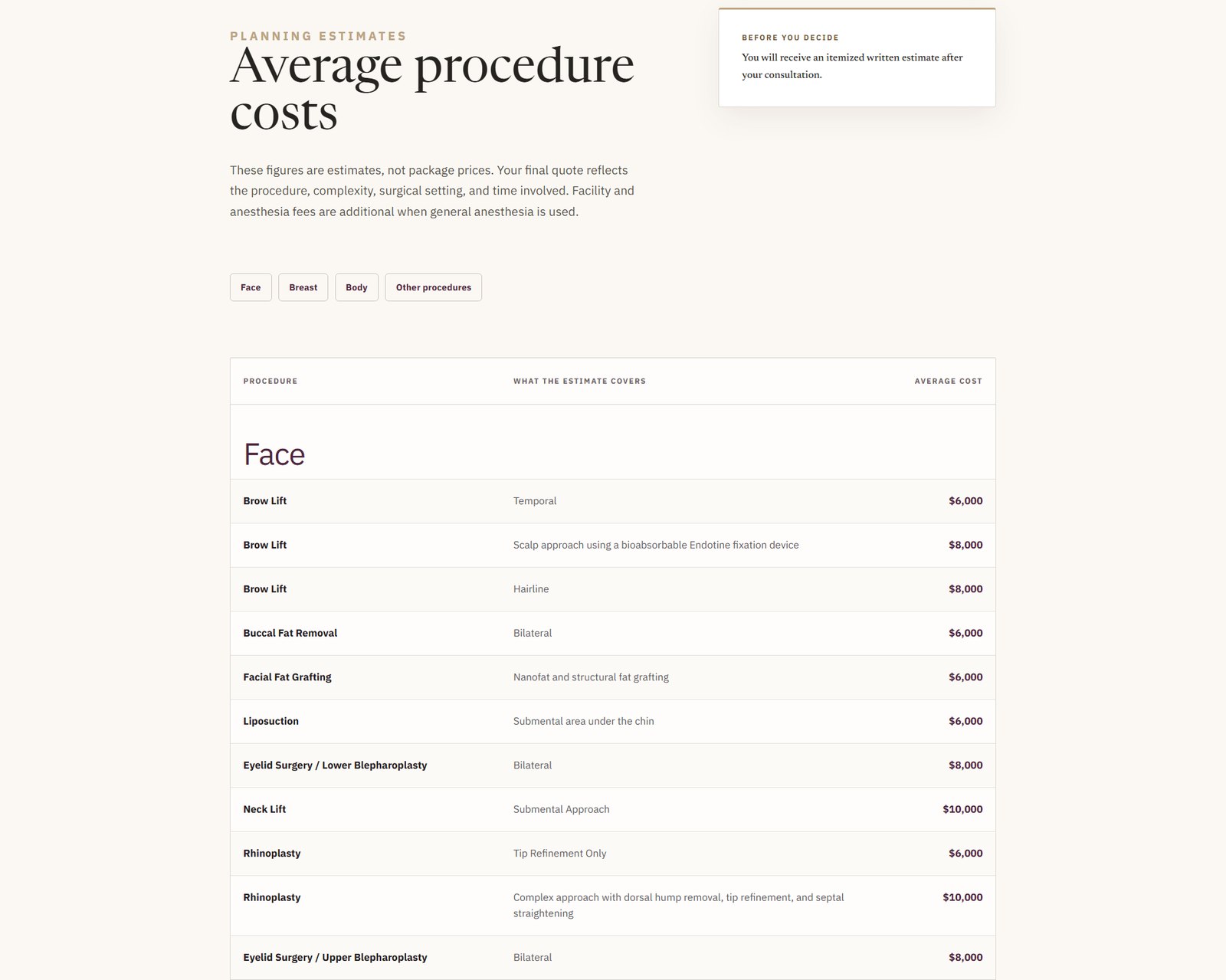
Elective surgery is the industry of “call for a quote.” This site publishes a full average-cost table, $1,000 to $22,000, procedure by procedure, before anyone has given up a phone number.

$1,000 – $22,000every average cost published, labeled “estimates, not package prices,” with an itemized written estimate promised after consultation.
The financing page's average procedure cost table: Face procedures with what each estimate covers and the average cost, for example Brow Lift, Temporal, $6,000
Each row names what the estimate covers, so a “$8,000 rhinoplasty” and a “complex approach with dorsal hump removal” are never confused.
Why publishing beats teasing

A visitor who has seen the table books a consultation already knowing the scale of the investment, which respects both parties' time. The page pairs the table with monthly payment plans through Cherry, introduced with unusual candor for the category: applying happens directly with Cherry, and the page says outright that checking options does not guarantee approval or a particular rate. Price transparency also disciplines the design itself: a table this dense forced the quiet white panel, generous row height, and a covers column written in sentences.

Decision two

Twelve templates, one action

There is no newsletter, no quiz, no chat widget. Every page ends at the same place: a consultation with the surgeon, $275, applied toward a procedure.

12 → 1every template funnels to Book a consult; the fee converts browsers into planners.
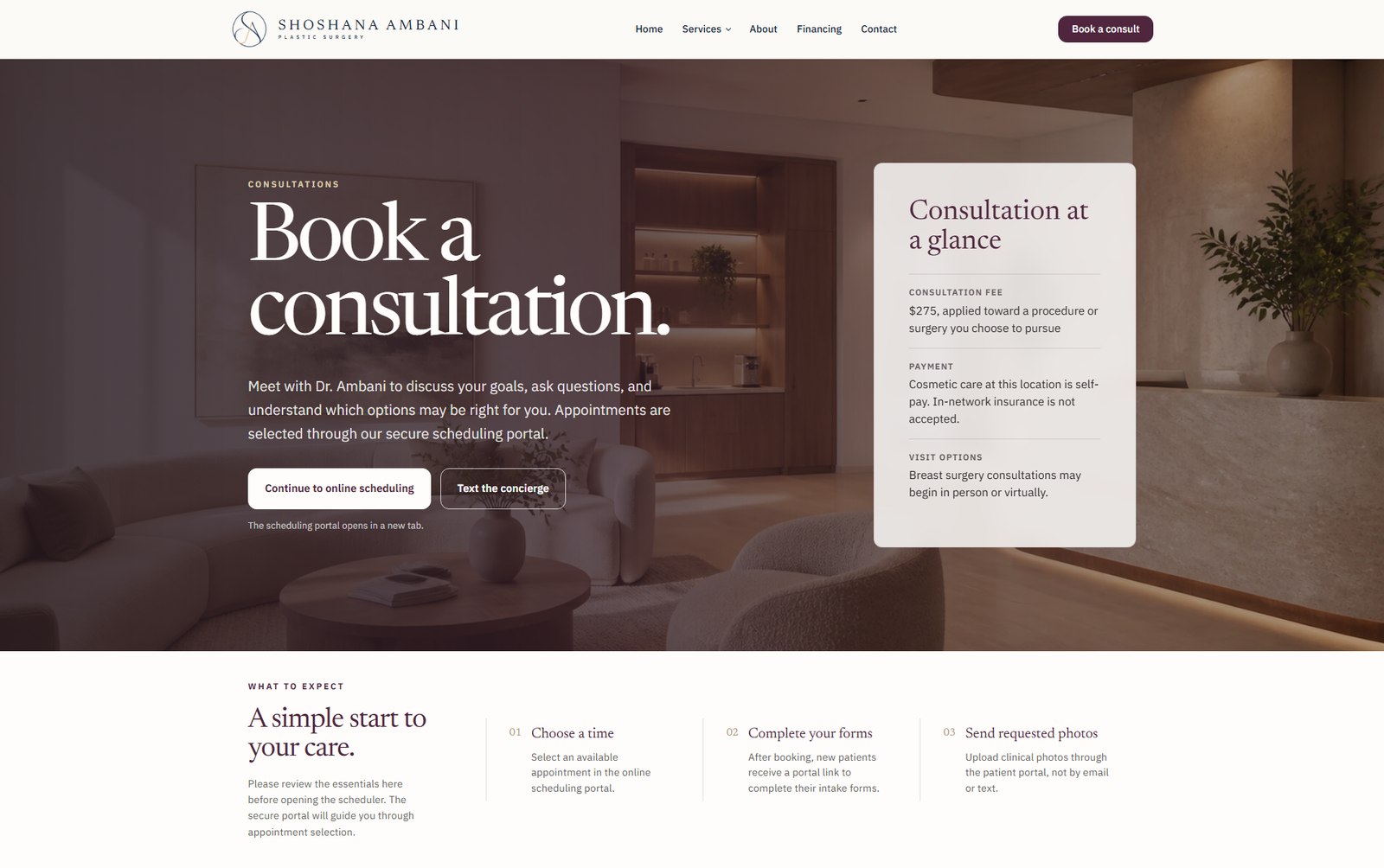
The booking page: Book a consultation, with a Consultation at a glance card and a three-step What to expect strip
The booking page states the fee, the visit options, and the three steps before opening the scheduler.
Choose a time

Appointments go through a secure scheduling portal, not a contact form that goes nowhere.

Complete forms

Intake happens in the patient portal after booking, so the public site never asks for medical history.

Send photos safely

Clinical photos travel through the portal, never by email or text. The site repeats this rule wherever photos come up.

The virtual-first path for breast surgery

Patients considering breast surgery can choose a virtual first visit, and both visit types use 3D simulation to discuss possible outcomes. That single option removes the biggest scheduling barrier for the practice's largest procedure family, and it is why the out-of-town page can honestly say a first conversation requires no travel at all.

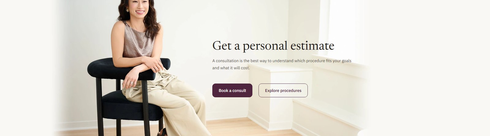
The pre-footer band: Get a personal estimate, over a full-bleed photograph of Dr. Ambani seated in the practice, with Book a consult and Explore procedures buttons
The same pre-footer band closes five templates, photographed, not tinted: the surgeon herself makes the ask.

Decision three

Trust is shown in the fine print

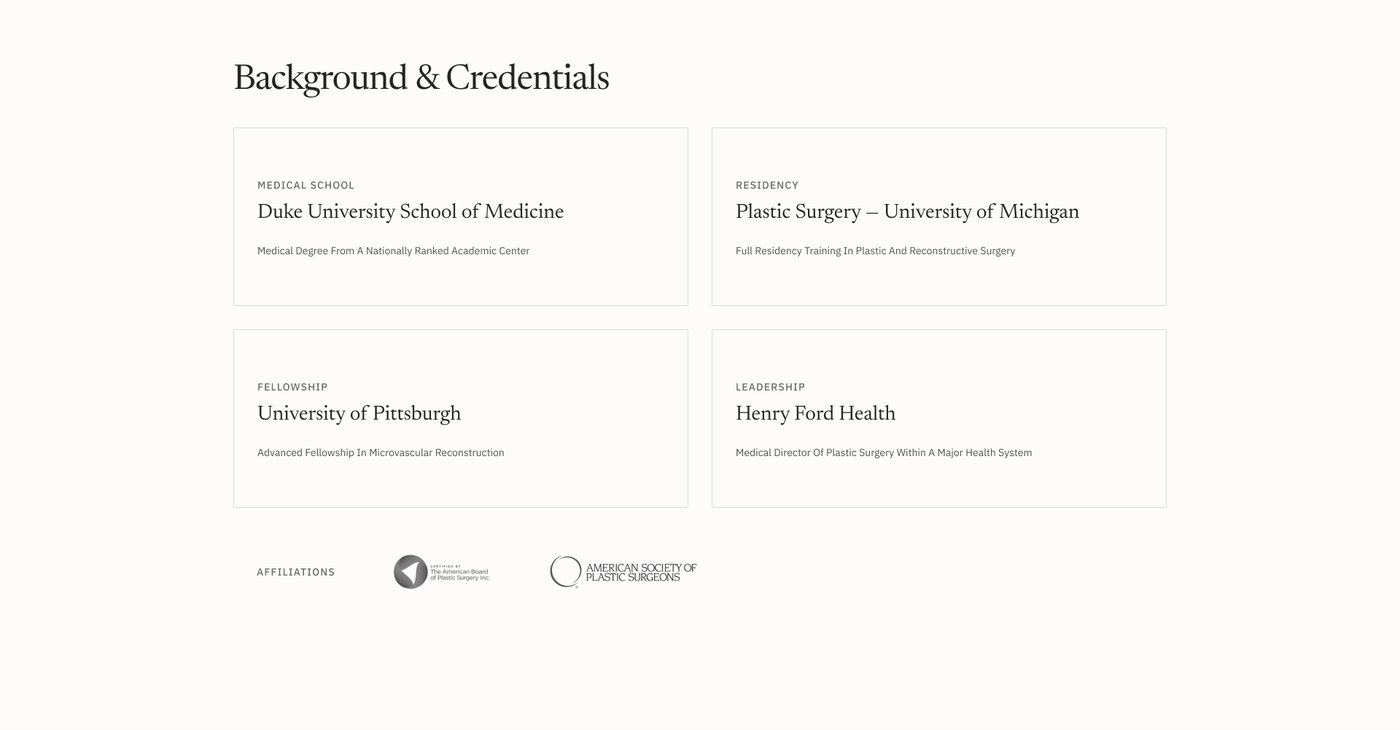
Credentials do the persuading: ABPS board certification, training at Yale, Duke, Michigan, and UPMC, and twelve Google reviews reproduced in full. The site's most distinctive voice, though, is its disclaimers.

Financing is provided by Cherry and its lending partners, not by Shoshana Ambani Plastic Surgery.
The financing page, refusing credit for the credit.
Reviews reflect individual experiences. Results and experiences vary from person to person.
The reviews page, above twelve unedited reviews.
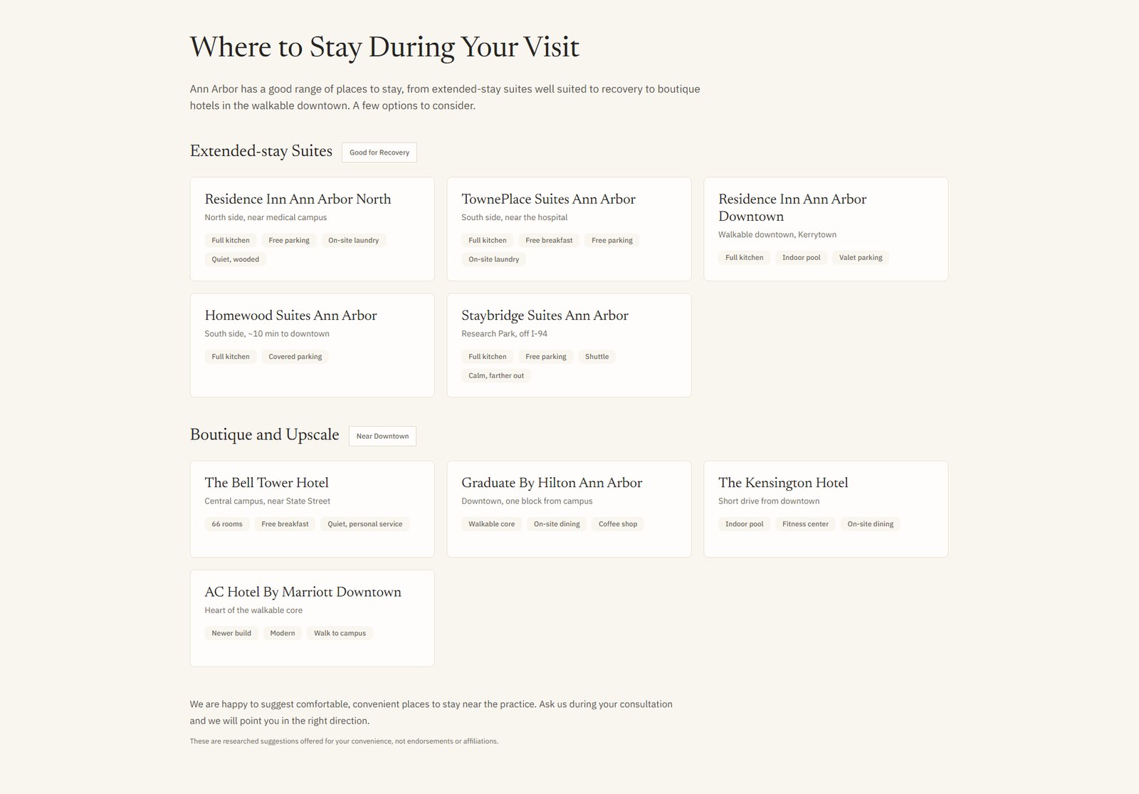
These are researched suggestions offered for your convenience, not endorsements or affiliations.
The hotel list on the out-of-town page.
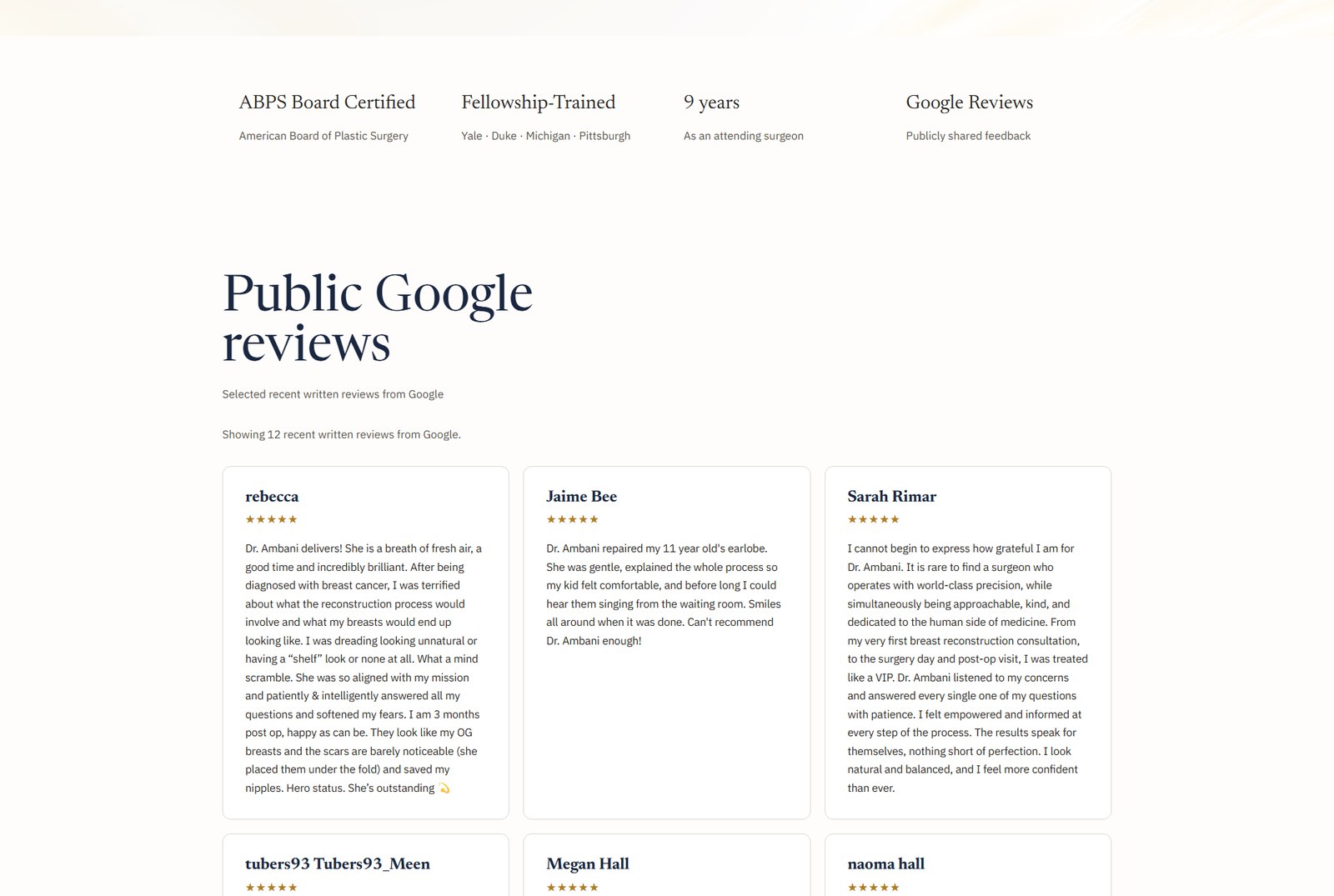
The reviews page: a credential strip with ABPS Board Certified, Fellowship-Trained, and 9 years as an attending surgeon, above full-text public Google reviews
Reviews run at full length, sourced from Google, with the credential ledger above them.
Why a medical site should sound like this

On a page asking for surgical trust, small honest sentences compound. The surgeon's own quote on the homepage sets the register: “My goal is never to make someone look like a different person. It's to restore form and function, and to preserve what already makes a patient look like themselves.” The design's job was to protect that voice: no urgency mechanics, no countdown offers, no stock smiles, and disclaimers set in readable type instead of eight-pixel gray.

Decision four

The site plans your trip

Patients travel from across Michigan and beyond, so the out-of-town page is designed as an itinerary: airport, hotels, recovery, the ride home.

9 hotelsresearched and grouped by recovery fit: extended-stay suites with kitchens and laundry, then boutique stays downtown. 24 hoursthe responsible-adult rule after surgery, stated twice, never softened.
The out-of-town page's Where to Stay section: extended-stay suites tagged Good for Recovery with amenity chips like Full kitchen and On-site laundry, then boutique and upscale options
Amenity chips are chosen for recovery, not tourism: full kitchen, on-site laundry, free parking, quiet.
The journey in order

The page walks the actual sequence: begin with a virtual consultation if the drive is not practical; fly into Detroit Metropolitan, about 25 miles and a 30 minute drive; stay somewhere with a kitchen; plan around a travel-home window that the surgeon sets per procedure rather than a generic promise. Even the FAQ is written from the traveler's side: what airport, how long, who has to stay with me. A page like this converts anxiety into logistics, which is the most calming thing a website can do.

The visual language

Warm plum, cream, and a surgeon photographed as a person

The palette is deep plum on cream, the display face is Newsreader with italic closing phrases, and every photograph is the real surgeon in the real practice. No stock, no gradients pretending to be brand.

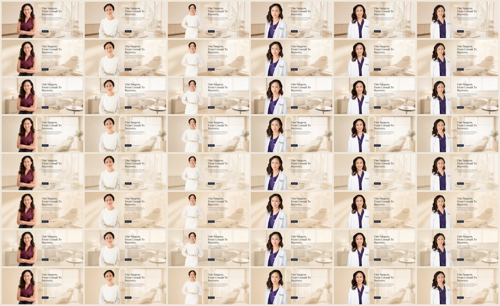
48hero compositions explored before the shipped direction; five credential-band variations alongside.
DisplayNewsreader, italic tails on the homepage headline only
WayfindingIBM Plex Sans for navigation, labels, and body
PalettePlum #4f263d on cream; the dark hero overlays are warm brown gradients over real photographs
Rhythm128px section spacing held across all 12 templates
PhotographyThe surgeon and the practice: her portrait, the consult rooms, the library, the front desk
A contact sheet of 48 explored hero compositions for the homepage One of five explored credential band variations, listing board certification and training institutions
The exploration sheets: 48 heroes and 5 credential bands, kept in the working file.

How this design became a governed Figma system, tokens, variants, and a full production rebuild, is its own story: the systemization case study.

Illustrative research and process

Who the decisions were tested against

Composite personas reconstructed to document reasoning, not field research. No persona maps to a real patient.

Three personas and six user stories, mapped to shipped features

Teresa

52 · weighing reconstruction options after a mastectomy plan

Arrived at plastic surgery through oncology, not aspiration. Exhausted by medical logistics and allergic to anything that reads like selling.

  • Reads credentials before anything else
  • Wants other patients' words, unedited
  • Will not send photos of her body over email

Dana

34 · researching rhinoplasty · three hours away

Has wanted this for a decade and researched it for a year. The distance, not the decision, is the obstacle.

  • Needs a first step that does not require travel
  • Plans the trip and the recovery in the same tab
  • Compares surgeons on specifics, not adjectives

Marisol

41 · breast reduction for comfort · budget first

This is a quality-of-life decision she has postponed twice for money. She abandons any site that makes her call to learn a price.

  • Finds the cost table before the philosophy
  • Wants financing explained without being pushed
  • Books only once the numbers are plausible

Stories, and where the design answers them

As Marisol, I want prices before I call, so that I never sit through a pitch I cannot afford.
The average-cost table, $1,000 to $22,000, with an itemized estimate promised after consultation.
As Marisol, I want financing stated plainly, so that I know who I am actually borrowing from.
The Cherry section's disclaimer: provided by Cherry and its lending partners, not by the practice.
As Dana, I want to start without traveling, so that distance stops deciding for me.
The virtual consultation, with 3D simulation available for both visit types.
As Dana, I want the trip planned for me, so that surgery does not become a travel project.
The out-of-town itinerary: DTW logistics, nine recovery-sorted hotels, a travel-home window set per procedure.
As Teresa, I want proof this surgeon is who she says, so that I can verify before I commit.
The credential ledger and twelve full-length Google reviews under an honesty disclaimer.
As Teresa, I want my photos handled like medical records, so that I never see them in an inbox.
The portal-only photo rule, repeated on booking and contact pages: never by email or text.
Where it stands

Live and taking bookings; no numbers invented. Counted on the site:

Live

shoshanamd.com, the practice's production site

$1k–$22k

published average costs across the procedure catalog

12

page templates, one shared action

30+

procedures across face, breast, body, and focused care

$275

consultation fee, applied toward a procedure

9

hotels researched and grouped by recovery fit

The honest caveat

The site is newly live, so there are no conversion numbers to claim yet, and this case study deliberately claims decisions rather than lifts. The strongest evidence for the pricing decision is structural: in a category where competitors gate cost behind a phone call, a published table is a position, not a widget. When booking data accumulates, this page gets a results section; until then it does not pretend to one.

What working on it taught me

The most persuasive element on the site is a table. Warmth got the visitor to stay, but candor is what a scared reader actually converts on: a price, a fee, a rule about photos, a window for the ride home.

Maria Angelika AgutayaWorkflow Engineer · mariaangelika.com · Designed for Shoshana Ambani Plastic Surgery, 2026