

The contract
The variables were off limits
Six variable collections and responsive modes were already live. The rule for the whole engagement: bind to what exists, change nothing. A bounded-deviation log records every intentional departure, so an auditor can tell a decision from drift.
⚠ VARIABLES ARE READ-ONLY. For this Client-First restructure, adopt/bind the existing tokens only. NEVER create a parallel collection, NEVER edit a variable's value.The project's standing rules file. A verify script compares the live file against the token contract on demand.
The one authorized edit
The h1 token was broken on arrival: 64px across all three breakpoints, with tablet and mobile line-heights set to 0. As a logged exception scoped to exactly that pair, I set the ramp to 64/48/36 with line-heights 70.4/52/40, matching the file's own h2 downscale step and snapping to its 4px grid. Every other token left untouched, verified before and after each page.
The method
One nest, every page, both breakpoints
Finsweet's Client-First gives a Figma file the same discipline a codebase gets from a style system: one canonical wrapper chain, backgrounds only on the section, horizontal padding and vertical padding on separate layers, content constrained to 1280.
Each page was cloned, wrapped into the nest, and re-bound by script; mobile frames are the same structure with Spacing and Typography switched to their Mobile modes, then reflowed. Three audit passes, each run until the counter read zero:
exact-match gaps and paddings bound across the two homepage frames. Exact values only; 42 fractional decorative insets flagged and left raw rather than snapped.
a sweep across all nine restructured pages, plus 8 section paddings rebound from flat to responsive tokens so mobile downscales everywhere.
the Out-of-Town page brought to the same bar, 124 off-scale chip paddings snapped to the ladder.
Why some values stayed raw, on purpose
31 section paddings sit on flat spacing tokens by rule: no responsive token shares their desktop value, so rebinding would move pixels on a finished design. Content gaps bind to flat tokens by design; only section and global padding carry the per-breakpoint downscale. Forcing everything onto the ladder would have traded fidelity for a tidy audit, the wrong trade on a live client file. Each exception is written down next to the rule it bends.
The components
763 button instances, promoted without losing one
The primary CTA was a single component with 211 instances across the site. Promoting it in place made the original the Default child of a new variant set, so every instance kept its text override and simply resolved to Default. Repeated for secondary, ghost, and link: four sets, six interaction states by three sizes, hover and press prototyping propagating to all 763 instances at once.
Four of the six states, rendered here with the file's own hex values; Disabled and Loading complete each set. Active runs one step deeper than Hover because those two tokens shared a hex, and a press has to be visible.
Beyond buttons
The library consolidated onto one canonical components page: responsive Header and Footer sets, a desktop megamenu wired into the header as a toggle variant, an iOS-style drill-down drawer for mobile services navigation, and 27 Lucide icons converted to swappable components. A retrofit pass swapped one page's ad-hoc frames for instances: 9 hotel cards absorbing 29 hand-built chip rows, 43 badges, and 7 of the client's own FAQ accordions. That accordion is also the week's discovery lesson: I built a redundant one before finding theirs on a deprecated page, deleted mine, and widened component discovery to every page, not just the library.
The proof of the system
A new page, composed from a wireframe in the same tokens
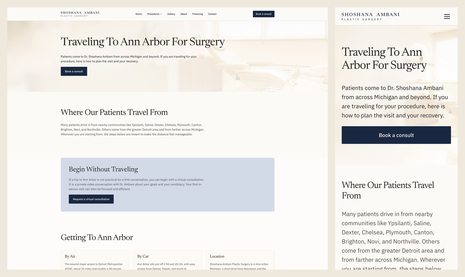
The Out-of-Town Patients page started as a lo-fi wireframe and came out a finished 1920px design plus a 375px mobile build: 98 of 98 text nodes on the file's text styles, zero unbound solid fills. Where the client still owed real content, recovery windows, travel guidance, the sections render as dashed placeholders: on a medical site, invented clinical copy is a liability, so the gaps stay visible.
The mistake in the first pass, kept on the record
My first compose hand-set font names and sizes instead of applying the file's 17 text styles, which left font families unbound and the type detached from the system. Root cause: I skipped style discovery and sampled another page's rendered values. The retrofit applied styles to all 98 nodes and the rule moved into the project's standing checklist: read the style catalog before typing a single node.
Verification
Sign-off moved from pictures to geometry
Mobile reflow has a failure mode where fixed-height parents and fill-height children starve each other: one article frame collapsed to 50,158px of overlap. Figma's render service served stale composites throughout, so sign-off moved to a geometry detector: sum the children's heights, compare against the frame. All 16 dev-mode annotations on the mobile frames closed against that detector.
get_screenshot served stale renders throughout. Verified via a geometry detector (Σ children heights vs frame height) + isolated-leaf shots, not composites. Re-scan: 0 annotations remain.Build log, annotation cleanup, June 2026
The recurring traps, named
Three reflow bug classes accounted for nearly every annotation: fill-height cards splitting a stacked grid's height, fill-width text refusing to wrap inside horizontal icon rows, and fixed-height frames overflowing after content reflowed taller. Each got a mechanical fix and a written rule. The collapsed article frame ended the week at 7,859px, laid out correctly at 375.
Production
The design, live in Ann Arbor
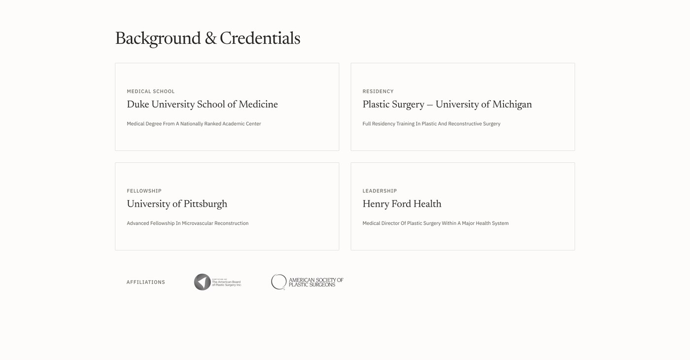
The practice site is live at shoshanamd.com, and what shipped is this design: a hero explored through 48 variations before production committed to the plum treatment, a credentials story grown from its variation set. The design kept evolving after this snapshot, which is what a systemized file is for.



What changed between file and production
Production is WordPress. Between this file's June snapshot and launch, the credentials band went dark, gained an education line and a statistics row, and the hero committed to the plum treatment; the type system, photography set, and page architecture carried straight through. Gallery and before-and-after material is deliberately absent from this page: patient imagery stays out of portfolio use.
Where it stands
The design is live; the master file carries the structure and library for whatever ships next. Measured in the work:
pages restructured to Client-First, each at Desktop and Mobile
button instances preserved through four variant-set promotions
spacing values bound to tokens in the three audit passes alone
text nodes style-bound on the page composed from a wireframe
dev-mode annotations resolved on the mobile frames
authorized token edit in seven days, logged and scoped
What did what
Both layers of this file are mine: the page designs and the systemization underneath them. Claude Code executed the plugin-API scripts and audits. I owned the design direction, the read-only token contract, per-section approval of every restructure, the calls along the way (the 14/16/18 button ladder, the drill-down drawer, dashed placeholders over invented clinical copy), and the verification bar each page had to clear. The production build is WordPress; this page measures the design file it shipped from. Run again, one thing changes: style and component discovery become step zero instead of a lesson paid for in a retrofit.
Maria Angelika AgutayaWorkflow Engineer · mariaangelika.com · Ambani design and systemization, 2026