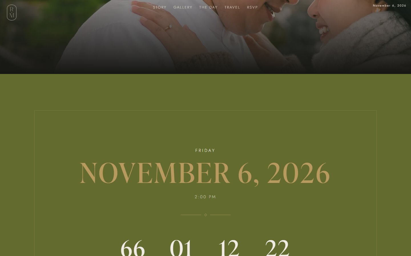
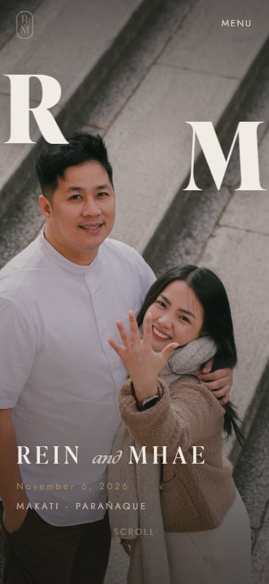
The problem: a wedding site is an emotional artifact and an operations tool. Most builds nail the first and bolt a Google Form onto the second.
What I did: guests find their own name instead of filling a form. RSVP storage, confirmation emails, and a CMS all run from a static host.
The result: live, 103 guests on the list, one response per guest, and a site the couple edits without me.
The couple needed something they were proud to send, and something that could collect accurate answers from more than a hundred guests. The brief made the RSVP part of the story: no screen that looks like data entry.
The design bar was an awards-caliber editorial site: typography-led, dark luxury, built around their real Kyoto prenup photography. The operational bar was a working RSVP system, matched against the couple’s actual invite list, with answers they could trust when the caterer asked for a headcount. The agency rule underneath both: vanilla HTML, CSS, and JS. No framework, no backend server. Every system had to be assembled from a static host and a spreadsheet.
The couple’s own feedback shaped the flow directly. They asked for no meal-preference field and no guest-count field; each invitation reserves exactly one seat, and the RSVP card says so in their voice: one seat has been reserved in your honor.
Decision one
The obvious build is a form with a name field. Instead, the first interaction is finding yourself on the list. One UX choice carries the mood and the data quality at the same time.
Lookup does three things a form cannot. It sets an intimate tone, because the site already knows you are invited. It removes the anxiety of wondering whether you filled it in right. And it keeps the data clean, because a response can only exist for a person who is actually on the list.
The unkind version of a guest gate is one that rejects people over spelling. The matcher strips honorifics and ignores accents, so a guest typing plain letters still finds a name with an enye in it, verified against a real guest surname. Strangers are rejected on lookup and again server-side on submit, so the gate holds even against someone posting directly to the endpoint.
The system allows one response per guest. A returning guest sees their answer instead of a fresh form, and anyone claiming an already-answered invitation gets a card with the couple’s contact details rather than a silent overwrite. That rule was verified against a real guest’s real decline before it shipped.
Decision two
The vanilla constraint ruled out a backend. So the backend became things the couple already understands: a spreadsheet, an email, an edit button.
The gate fails open. The RSVP form pings the backend on load and only activates the lookup gate when the deployed script answers; if the backend is ever down, guests can still submit, because a wedding site that refuses an RSVP is worse than one that accepts an unverified one.
The site’s HTML is generated from one content file through a template, with a parity check that diffs the generated output against the handcrafted original. It reached zero token differences before the CMS went live, so handing the couple an edit surface never meant handing them a different site.
Duplicates are rejected before anything is written or sent. The server checks whether a guest has already answered before the row lands and before the email goes out, not after.
Decision three
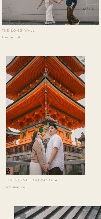
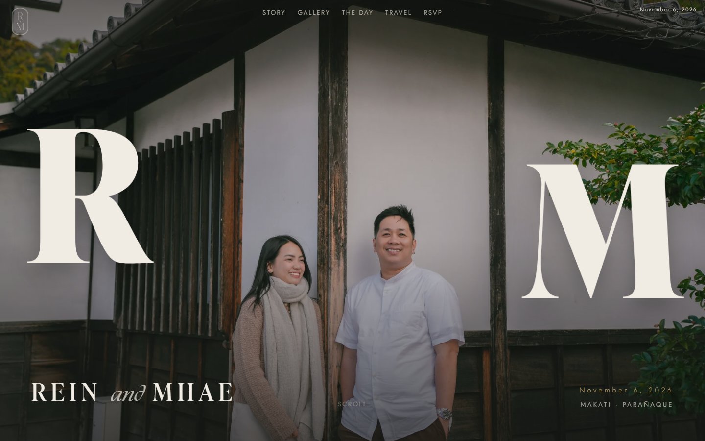
The couple’s Kyoto prenup is the whole visual argument. Each viewport gets its own crop and its own composition, chosen shot by shot from 70 originals.
The design system behind the site is a short list of rules rather than a component library: sixty to seventy percent negative space, warm tones with no pure black or pure white anywhere, at most five elements on screen at any scroll position, and transitions that take their time, because slowness reads as luxury. Typography does the heavy lifting; the giant R and M letterforms in the hero are windows into one continuous photo strip, sharing a locked horizon line so both faces survive the crop.
The photography itself was curated from the couple’s 70 prenup originals, with per-slot crops cut by hand where automated attention-cropping lost the couple. Ornament is typographic: hairline diamond dividers, dotted brass leader lines on schedules and gift funds, and line-art plates generated from the couple’s own photos and the real church, recolored into the brass.
Decision four
When a guest’s system asks for less animation, the site turns off the animation engine entirely. Every photo, every section, every word stays.
An earlier iteration of this project opened with an animated envelope, and its reduced-motion check removed the envelope entirely. That failure surfaced on the designer’s own machine, a Windows laptop with system animations disabled, which is common on gaming hardware and means real guests would silently lose the entry experience too. The lesson carried into this build as a hard rule: accessibility settings may simplify how something moves, never whether it exists.
On the shipped site that rule is structural. All scroll animation runs behind one motion check; when reduced motion is on, the smooth-scroll library and the animation timeline never initialize, and the content is simply there. Photo reveals are gentle figure-level fades rather than clip-path zooms, and the confetti on a successful RSVP is gated the same way.
The case study you are reading runs on the wedding site’s own colors and typefaces. Every body-text pair on this page was computed, and the olive was darkened until it cleared AAA.
| Pair | Ratio | Grade |
|---|---|---|
| Ink body on paper | 16.94:1 | AAA |
| Ink body on parchment | 15.67:1 | AAA |
| Cream text on pine | 12.73:1 | AAA |
| Dim cream on pine | 9.76:1 | AAA |
| Olive links on parchment | 8.84:1 | AAA |
| Muted captions on parchment | 7.49:1 | AAA |
| Brass display numerals on pine | 5.49:1 | AAA, large text |
| Brass appears only as large display type on the pine ground, never as body text. The site’s display face is a licensed Adobe font, so this page substitutes Cormorant, the site’s own body serif. | ||
Live, in use, and waiting for November. Measured, not estimated:
guests on the invite list the lookup matches against
systems on a static host: storage, email, self-serve CMS
frameworks and backend servers; vanilla JS and GSAP only
response per guest, enforced server-side before the row is written
cumulative layout shift, measured headless with every image sized
prenup originals curated into per-viewport crops
The RSVP record is a spreadsheet because the couple can read a spreadsheet, and that choice has a real edge: there is no schema in front of hand edits. The server validates what guests submit, but nothing validates what a person types directly into the Sheet. If I rebuilt it, I would keep the Sheet as the human-readable record and put a thin validation pass in front of manual edits, without taking the spreadsheet away from the people who actually use it. The other honest note: the wedding is in November, so the system has been verified against real guests and real responses, but the full hundred-guest load has not happened yet.
The best interface for a non-technical client is often software they already know how to read. And one more time, with feeling: accessibility settings may change how, never whether.
Maria Angelika AgutayaDesigner and developer · mariaangelika.com · Built for Rein & Mhae, 2026