ClientPHOEBE, an indie pop rock band from Calapan CityMy partDesign and build, end to endTeamMaria Angelika Agutaya, soloStatusLive at phoebemusic.com
The problem: an electronic press kit is where a band gets reduced to a PDF nobody feels anything about.
What I did: tied palette, light, and type contrast to scroll position, so the page moves from afternoon into midnight.
The result: a static site on the band's own domain that stays smooth on a mid-range phone.
The format was the problem
Bio, photos, links, all flattened into a document. The design brief I set myself: make the format carry the band's mood, so a booker or journalist scrolling it comes away with an impression, not just an asset pack. The page had to read as authored while staying a fast, static site a band can afford to keep online.
Who the band is
PHOEBE are six members from Calapan City, together since 2013. They started as a cover band, went separate ways after college, and reformed to release their own songs: four singles so far, and roughly 8.7k monthly listeners on Spotify at the time of the build. The press kit had to serve two readers at once, a booker who wants the practical facts and a listener who wants to feel what the band is like.
Audience
Bookers, journalists, and new listeners
Constraint
Static hosting, smooth on a mid-range phone
Band
Six members, together since 2013, four singles out
Decision one
Let the scroll be the content, not a container for it
The day-to-night shift is not a decorative background. It is the press kit's argument: this band lives in the transition between afternoon and midnight. Moving down the page performs the band's arc instead of just revealing more text. The medium does the pitching.
1 scrollday to night in one continuous transition, no page cuts.
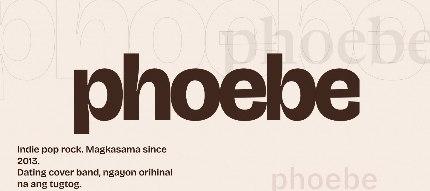
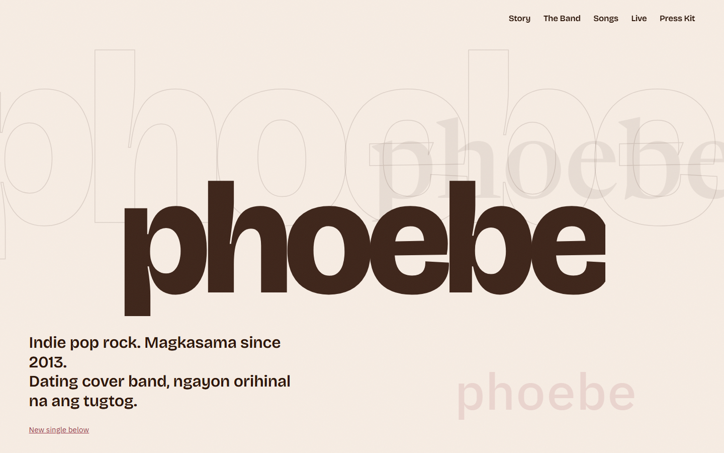
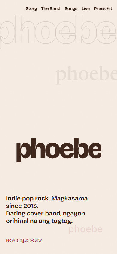
Act one, umaga. Cream ground, espresso type, the band name echoed as a type specimen.The dusk turn, pinned mid-scroll. The cover-band years end in daylight; the originals belong to the night.
How the transition is built
Static hosting and the phone requirement ruled out heavy libraries and video-backed hero tricks, so the whole atmosphere comes from CSS plus one pinned, scroll-driven dusk transition. The palette was drawn from the band's own brown and red photo sets: cream and espresso for the day act, near-black and oxblood for the night act. Two colors were banned outright during art direction, blue and orange, so the photographs keep those tones to themselves and never compete with the page.
Decision two
Two acts, two languages
The information layer is English, for the booker skimming on deadline. The emotional layer is Tagalog, marked up with lang="tl" so screen readers pronounce it as Tagalog rather than mangled English. Neither layer translates the other; each does its own job.
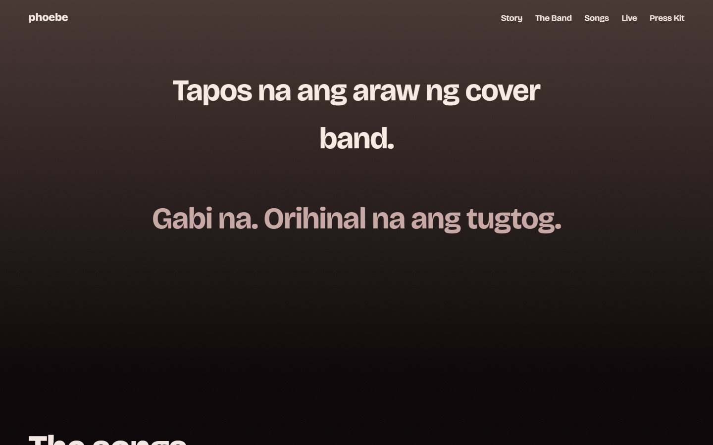
Tapos na ang araw ng cover band. Gabi na. Orihinal na ang tugtog.The dusk line that turns the page over: the cover-band days are done, it is night now, and the songs are their own.
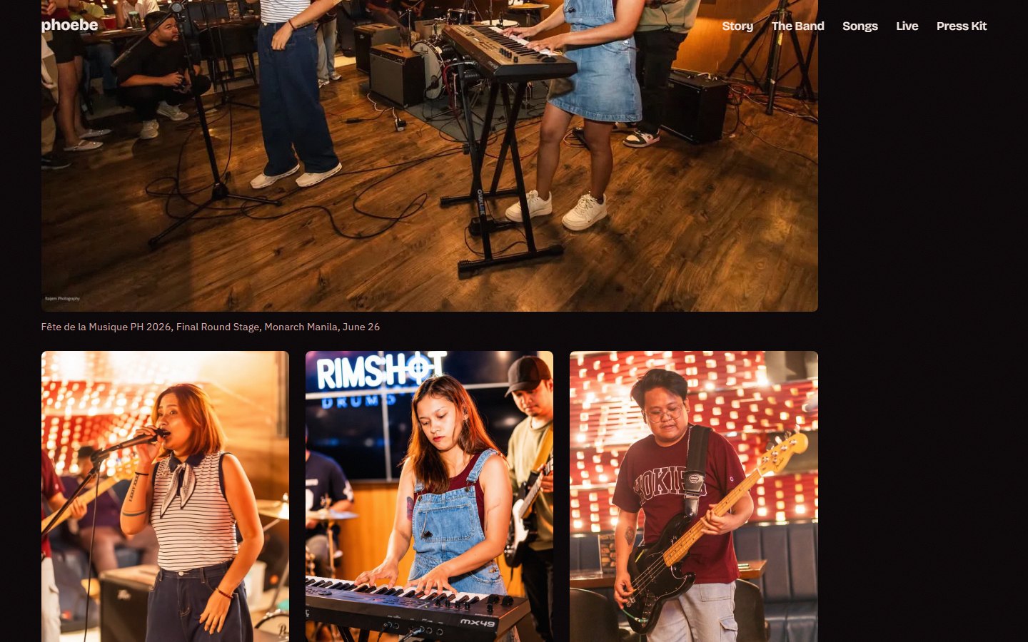
The Live section runs as a venue ledger: each gig named and dated, photos kept warm against the near-black ground.The art direction rules
Group shots only, no member hierarchy. The hero is a type specimen, the band name repeated in outline, serif, and mono ghosts, because a six-piece has no single face to lead with. The page closes on a full-bleed photo of the band pointing at the camera, in the red set, so the last thing a booker sees is the band looking back. Every rule came from working sessions with the client on the photo sets, and anything the band could not yet confirm stayed off the page entirely.
Decision three
Phone-first, static, cheap to keep live
A band's press kit gets opened from a bio link on a phone, on venue wifi. The transition had to hold smooth on mid-range mobile, and the site had to cost nothing to keep online: no CMS, no framework, no build step a musician has to maintain.
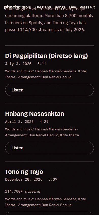
The day act at phone width. The specimen hero recomposes instead of shrinking.The songs list at phone width: release dates, credits, and streaming links per single.
The bug that shipped, and the deploy that catches the next one
One real bug made it to the live site on launch day: the band's clips were TikTok downloads, which default to HEVC encoding, and HEVC fails silently in browsers, a player that renders and never plays. Every video is now re-encoded to h264 before it ships. The deploy script also pre-checks Cloudflare Pages' 25MiB per-file cap before pushing, so an oversized asset fails on my machine instead of half-deploying, and it re-exports the API token because non-interactive deploys lose the login session.
This page's chrome
The case study wears the site's own palette
Everything above is set in the press kit's own colors and typefaces, pulled from its live stylesheet, with every text pair measured against WCAG.
Measured contrast, this page (WCAG 2.1)
Pair
Ratio
Grade
Ink headings on cream
15.08:1
AAA
Espresso body on cream
12.42:1
AAA
Soft brown captions on cream
7.88:1
AAA
Oxblood links on cream
9.27:1
AAA
Pale rose text on night
17.02:1
AAA
Dusty rose captions on night
9.35:1
AAA
Where it stands
1 scroll
day to night in one continuous transition, no page cuts.
Own domain
shipped to phoebemusic.com, not a subdomain.
Static
no CMS, no JS framework, cheap to keep live.
Phone-first
the transition holds smooth on mid-range mobile.
The honest caveat
Everything is one long document, which is right for the scroll but means a booker who only wants the tech rider has to travel the whole arc to reach it. I would add a quiet jump-to affordance that skips to the practical sections without breaking the cinematic default, so the mood is the first experience but not a toll on repeat visits.
What working on it taught me
A press kit is a pitch, and the strongest pitch was the format itself. The other lesson was restraint: the page got better every time something unconfirmed came off it.
Maria Angelika AgutayaWorkflow Engineer · mariaangelika.com · Designed and built for PHOEBE, 2026