Typographic monument
The name and claim carried entirely by scale and serif weight.
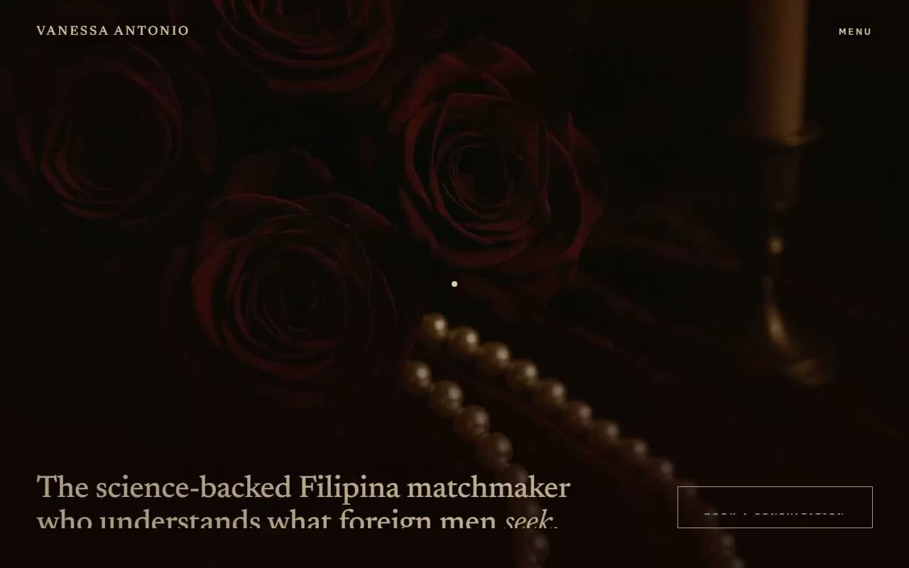
The problem: signal expense and trust without one loud element. No bright button, no urgency, no stock warmth.
What I built: a film reel. Full-bleed stills cut past each other on scroll, an ember trails the cursor, one locked palette holds throughout.
The result: a live concept with zero accent buttons and zero prices, where atmosphere does the persuading.
The client's team approved an official palette before design began: champagne gold, cherry black, blood, dark cherry, silver. With the rules that silver is text-only and gold stays near five percent of any surface, most of every screen has to be image and shadow. That scarcity became the design.
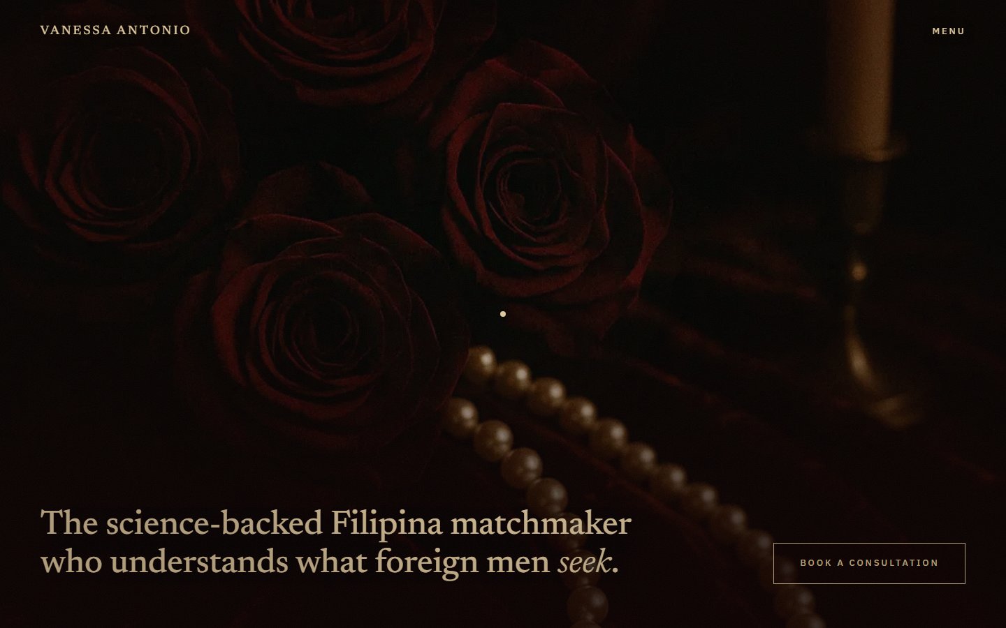
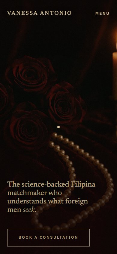
The visual brief was the client's own Pinterest board: dark cherry velvet, candlelight, gold, pearls, champagne coupes. The concept translates that board literally. The stills are velvet, candles, pearls, and coupes photographed in near-darkness, and the interface is only what the palette rules permit on top of them: gold keylines, gold small caps, silver supporting text. All on-page copy is quoted verbatim from the client's existing site, so the concept only had to argue about form.
Eight rejected explorations proved that describing directions in words was the bottleneck. The fix: three static, full-viewport comps, each a finished first screen, picked by eye in a single round.
The name and claim carried entirely by scale and serif weight.
Chosen. A cinematic frame with a title card, built out below as the full concept.
A formal card layout, engraved rules and centered small caps.
Eight directions argued in prose and mood references all stalled the same way. The three comps were built as static full-viewport screens, close enough to final that choosing one meant choosing everything, composition, type scale, and restraint level at once. The comparison page remains part of the project at /comps.html, and the method is now how I run direction disputes: fewer words, more finished frames.
Decision one
Every section is a full-bleed still. Each one is sticky, so the next scrolls over it like a cut in a reel: gold serif title-cards sit bottom-left, framed small-caps slates bottom-right.
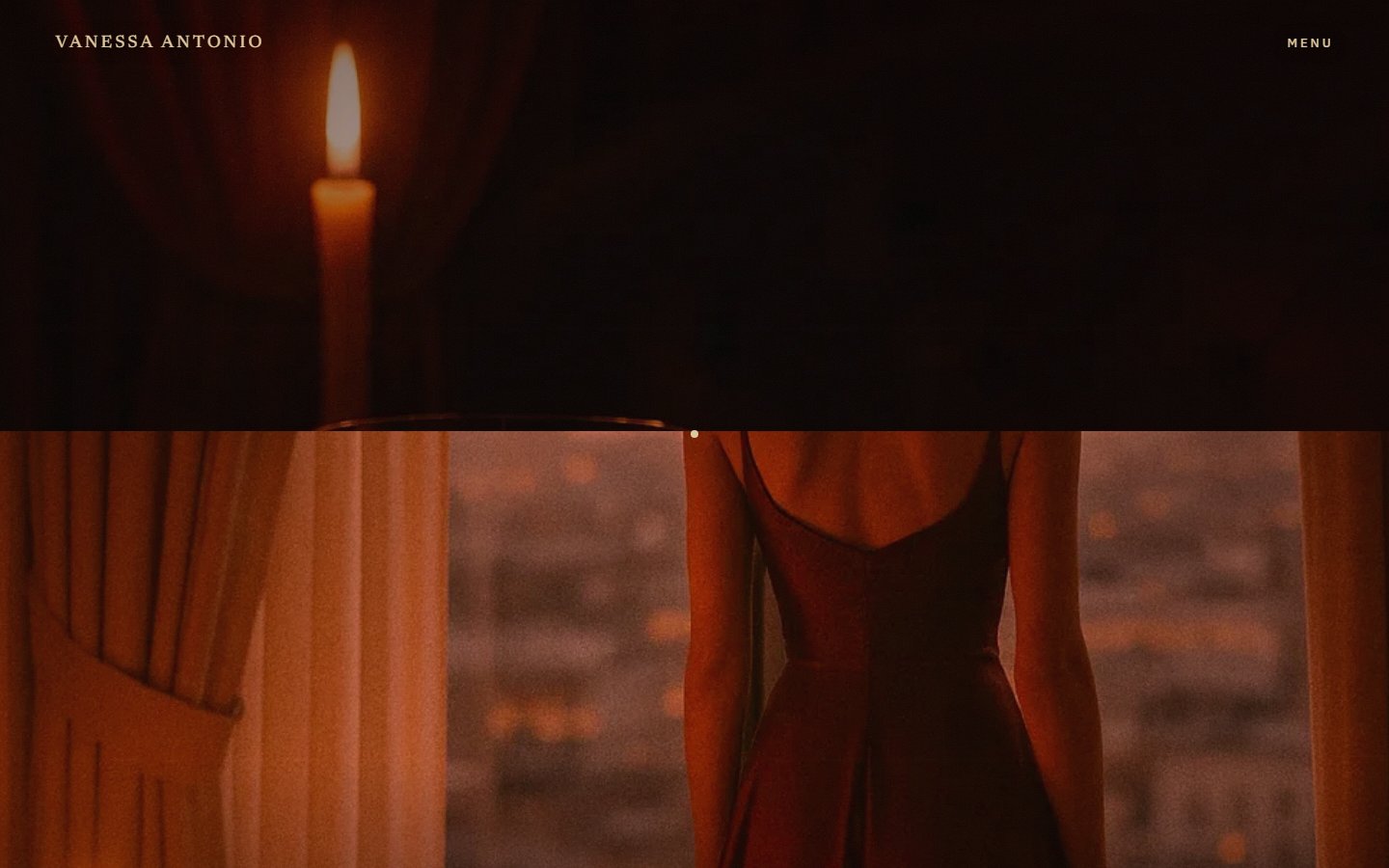
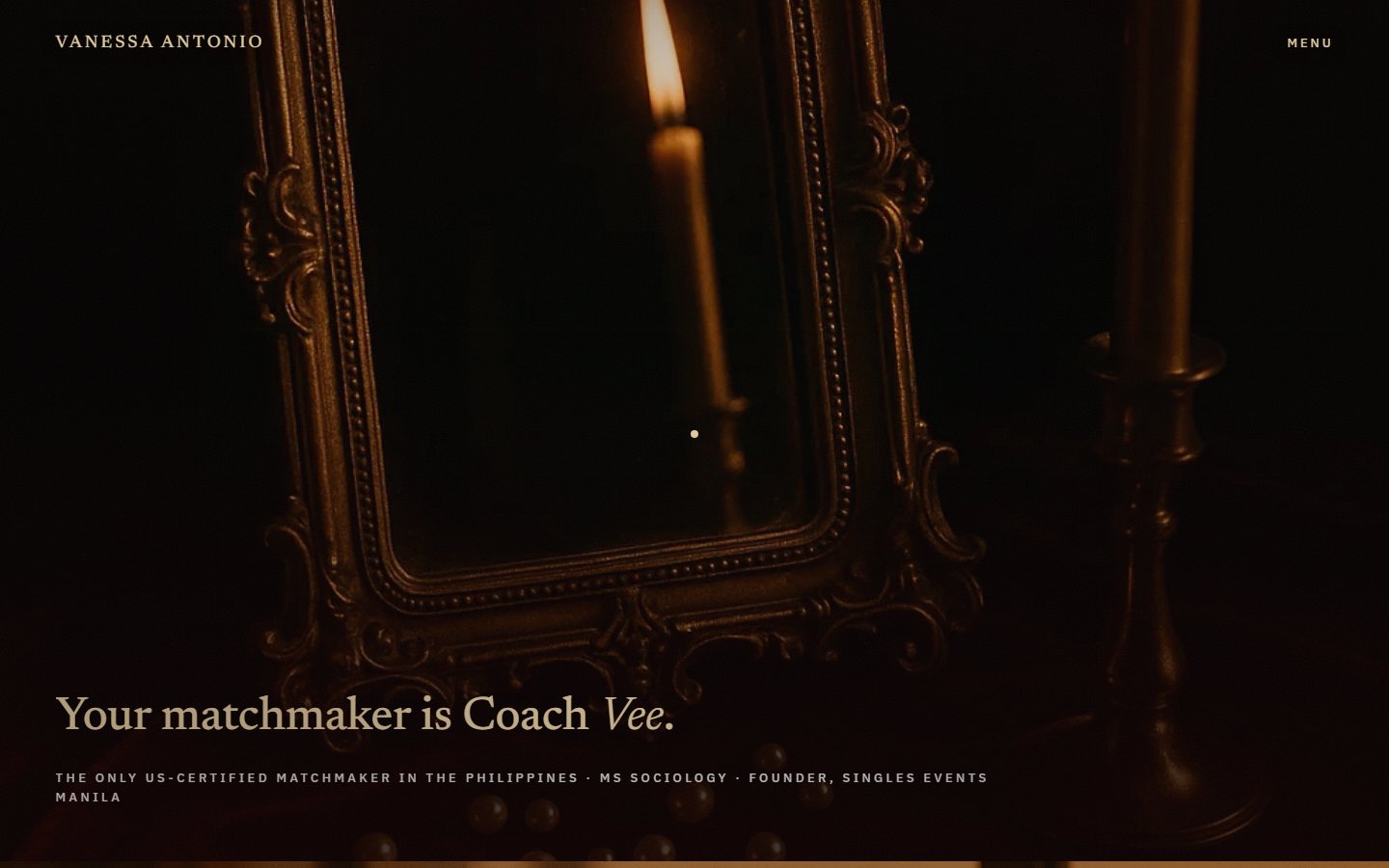
Headlines carry a subtle gold glint via background-clip on the text. The build's hard-won rule: a clipped headline must never be split into per-word spans, because animating the individual word spans silently breaks the clip and the glint dies. Line animation happens at the block level instead, and the constraint is documented in the project so a future edit does not reintroduce it.
Decision two
Every luxury-site instinct says place a gold button. The more expensive move is to trust the atmosphere: no accent-colored call to action exists anywhere. The ask survives as a quiet framed slate, small caps in the palette's own gold, and progression replaces persuasion.
| Pair | Ratio | Grade |
|---|---|---|
| Site: gold text on cherry black | 9.22:1 | AAA |
| Site: silver text on cherry black | 10.46:1 | AAA |
| This page: headings on paper | 14.09:1 | AAA |
| This page: body ink on paper | 12.12:1 | AAA |
| This page: links on paper | 11.78:1 | AAA |
| This page: captions on paper | 5.53:1 | AA |
The locked palette turned out to be an accessibility asset. Champagne gold on cherry black and silver on cherry black, the two pairs the client's rules force onto every frame, both clear the AAA threshold of 7:1 for normal text. Restraint and legibility asked for the same thing here: light text, dark ground, nothing in between.
Decision three
Every price mention was removed from the concept. Tiers appear as three text slips on a single velvet still, closing with one line: Investment discussed at your consultation.
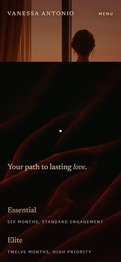
A price is the loudest element a page can carry; it converts a private consultation into a checkout. Naming the tiers and their durations while routing the number itself to the consultation keeps the page inside the service's own manner: discretion first, specifics in person. And the slate stays honest about what it offers: it books a conversation.
Decision four
With buttons and color mostly off the table, the site's single flourish is an ember that trails the cursor over a fine candlelight grain, with a candle-flicker vignette breathing at the frame's edge. It is kept deliberately, the one place the interface admits it is alive.
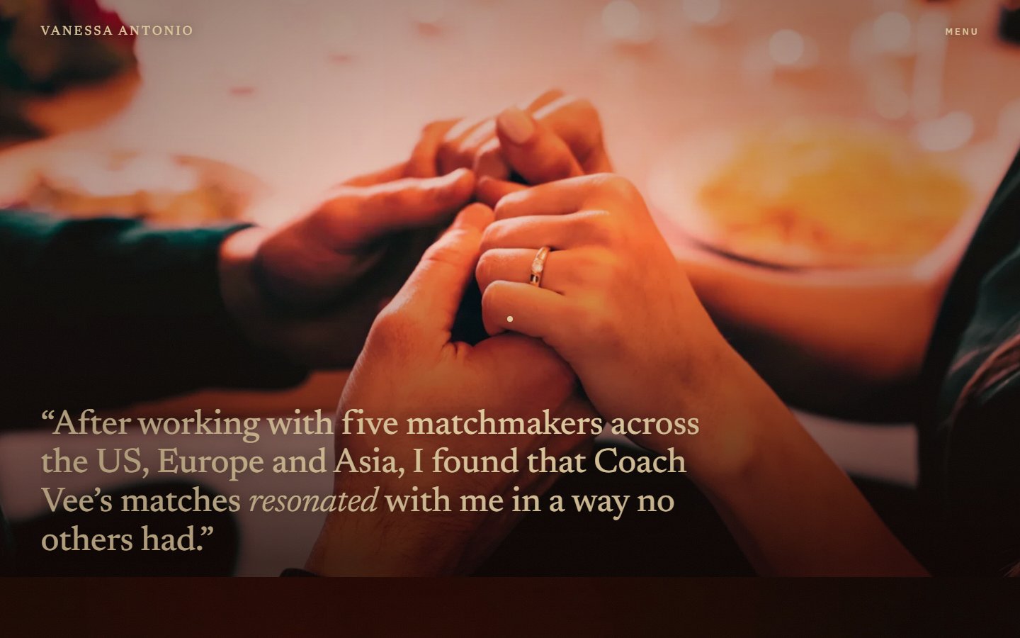
A restrained page with zero signs of life reads as unfinished rather than expensive. The ember is small, warm, and matches the candlelight already in every still, so it registers as part of the photography. Adding a second flourish anywhere would start an arms race with the first, which is why the count stays at one.
A live concept, not a shipped client engagement. What the build holds:
accent-colored call-to-action buttons anywhere
prices on the page; tiers close at the consultation line
locked hexes, the entire color vocabulary
gold surface budget per the client's usage rule
static comps to one direction, picked in one round
both palette-forced text pairs, 9.22:1 and 10.46:1
This is a concept demo. It runs live at a Vercel demo URL, its copy is quoted from the client's existing site, and the direction and palette were approved through the client's assistant, but it is not a commissioned production build and no engagement outcome is claimed. What it demonstrates is the craft position: that a dark, restrained, nearly buttonless page can carry a persuasive argument, and that the client's locked constraints did the design a favor.
Discretion on the web is mostly about what you refuse to add. The other lesson was procedural: after eight argued-and-rejected directions, three finished frames settled it in one round. I run direction disputes on finished frames now.
Maria Angelika AgutayaWorkflow Engineer · mariaangelika.com · Concept designed and built, 2026