ClientLabel 88, vintage thrift, Manila (@label88__)My partDesign and build, soloStackVanilla HTML, CSS and JS, no frameworkStatusLive prototype; piece details are placeholders
The problem: the shop sells weekly Instagram drops. Once a piece is posted and gone, it vanishes back into the feed, unfindable.
What I built: all 101 garments cut out of the shop's own flat-lay photos and hung on a draggable rail, each with its own record.
Where it stands: live at label88.vercel.app as a working prototype. Sizes, fabrics and prices are placeholders until the shop signs off.
The brief was a table, not a store
Label 88 sells one-of-one vintage shot flat on a table in Manila. New pieces drop every Saturday on Instagram, "off comments" means sold, and everything ships worldwide. The brief mandated vanilla HTML, CSS and JS, mobile-first, with every piece pointing back to the shop's DMs.
How the direction got picked
Three creative directions were briefed; a blend of a rush board and a table ledger won, and two full comps were built from it. The rush-lead comp beat the table-lead comp in review on 2026-08-03. The site later pivoted again: the shop layout stepped back to /shop.html and the archive became the homepage, because the archive is the part no template store has.
Audience
The shop's 15K Instagram followers, local and international
Drop day
Saturday, on Instagram
Source material
The shop's own flat-lay phone photos, no studio shots
the shape of the catalog
A rack, not a grid
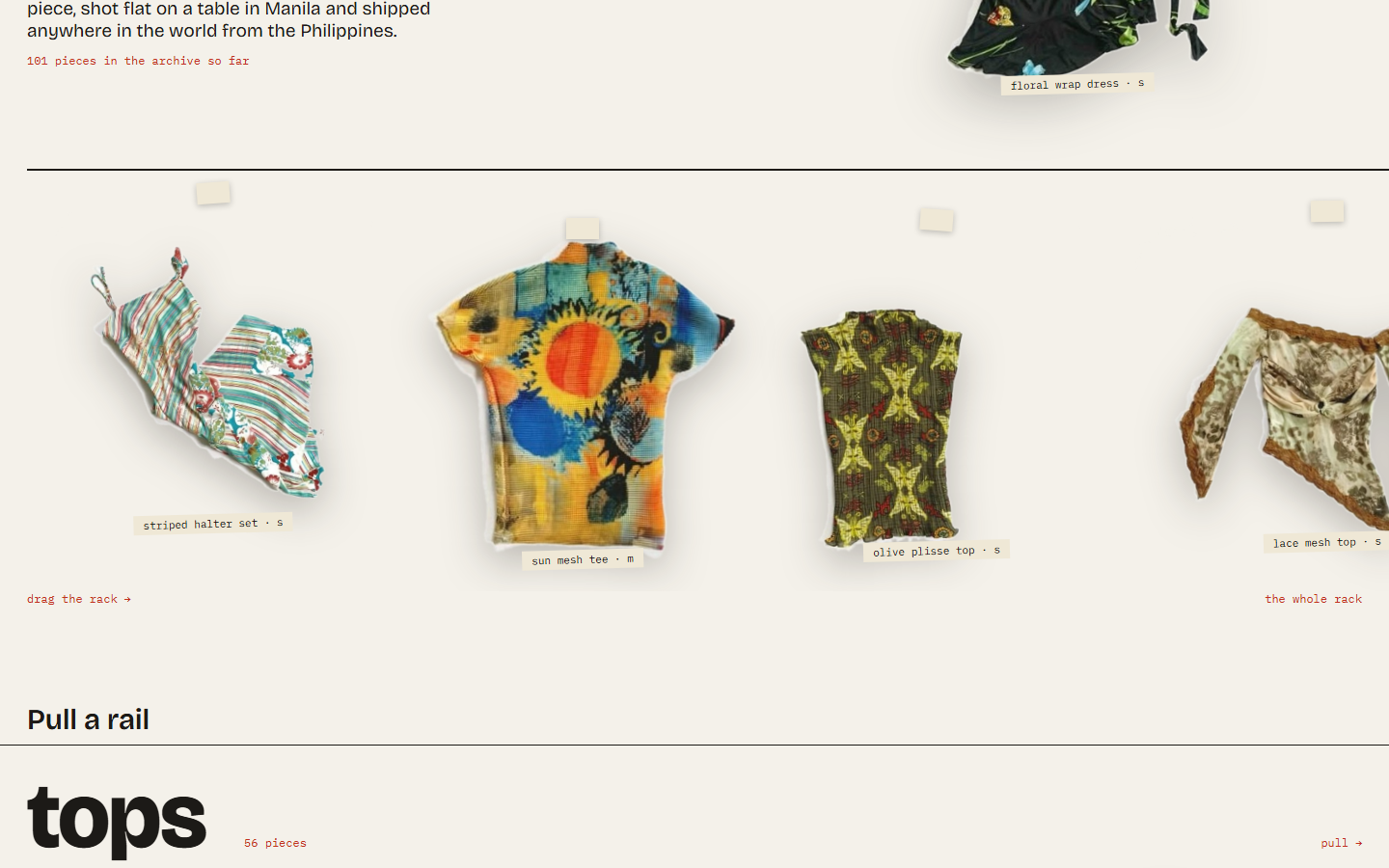
Every ecommerce instinct points to a responsive product grid. A grid treats one-of-one vintage like interchangeable catalog SKUs, which is the opposite of how thrifting feels. So the catalog is modeled as a physical rail: each garment hangs from a tape pin, sways from your drag velocity, and opens an accession record when tapped.
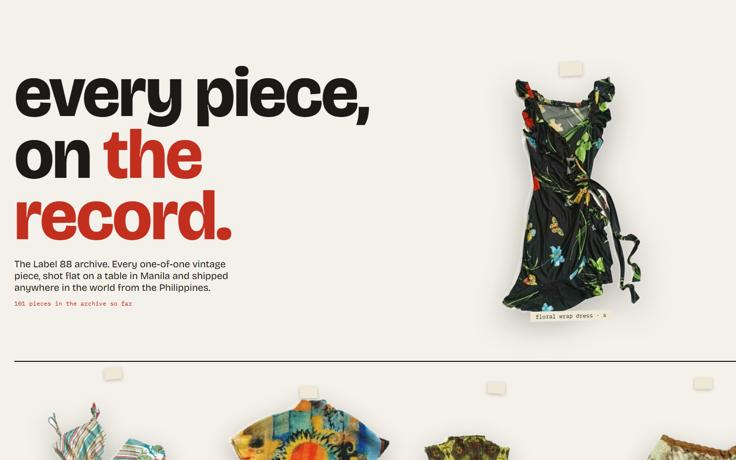
101 pieceson the rail, every one a real garment from the shop's table.
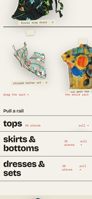
The rack at 1440. Native drag along the rail, mono tags naming each piece, and the whole rack one pull away.
The interaction mechanics
The rail is a plain horizontal scroller, so trackpads, touch and keyboards all work before any script runs; drag is layered on top, never hijacking vertical scroll. Sway angle is driven by drag velocity, and idle pieces keep a slow settle unless the visitor prefers reduced motion, in which case they hang still. Every garment is a real button: tap it and its record opens as a dialog with size, fabric and shot.
the raw material
101 cutouts from phone photos
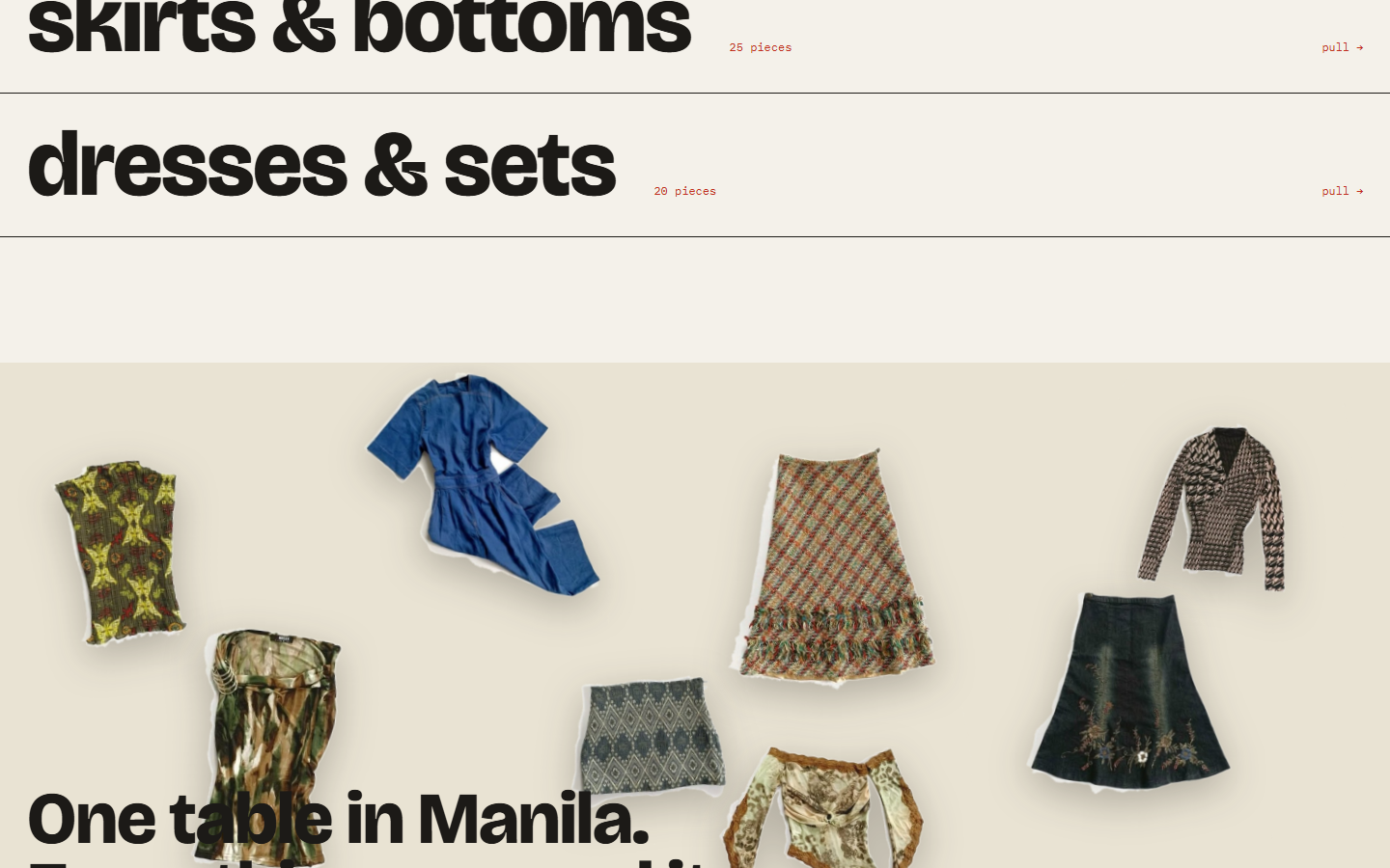
Nothing could hang until it had edges. There were no studio shots, so every garment was segmented out of the shop's own flat-lay photos into a clean alpha cutout, then sorted into three wings.
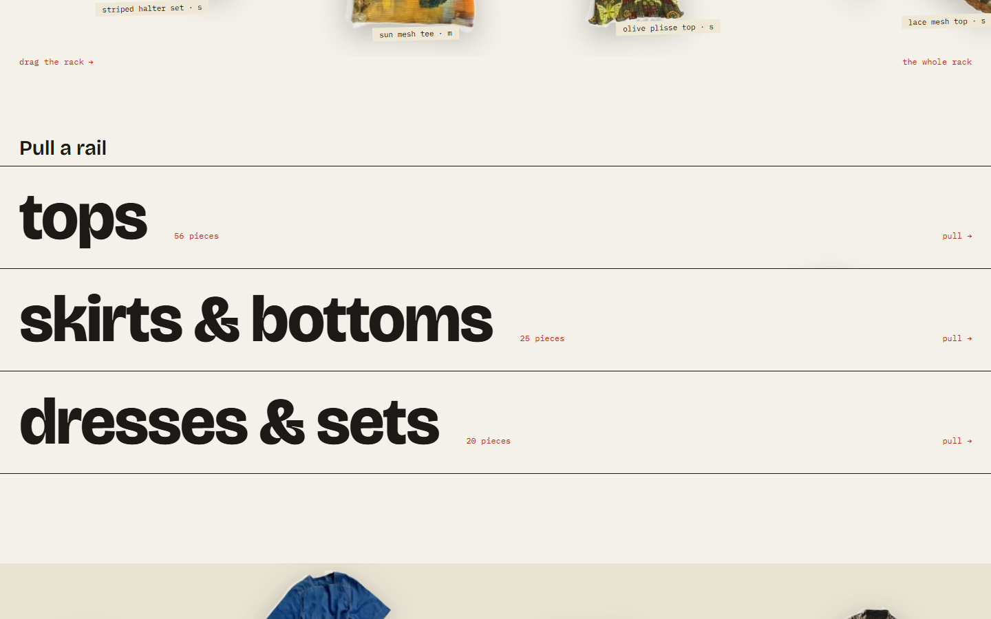
56 · 25 · 20tops, skirts and bottoms, dresses and sets, sorted into draggable rails.
The closing plate reuses the cutouts loose on the table, the way the shop actually shoots them.
How the segmentation worked
Each photo went through a border flood-fill to find the background, then connected-component cleanup to drop stray islands. Collage posts were the multiplier: one drop-preview image can hold twenty garments, and each clean single became its own cutout. Garments touching each other in a photo were discarded rather than shipped with ragged edges, and model shots were skipped entirely so the flat-lay language stays consistent across all 101 pieces.
what the record says
An archive with no sold sign
I cut the status layer entirely. No sold tag, no strikethrough, no running tally. A record card states size, fabric, shot, one of one. The archive treats sold pieces as part of the shop's history, in full color, not grayed-out inventory.
Pull a rail: the wing index in display type. Clicking a wing recuts the rack instead of paginating it.The same rail at 390, mobile-first per the brief.
Why the sold sign had to go, and what replaced filter chips
Sold states turn an archive back into a store: the eye reads gray strikethrough as clearance, not history. Cutting the layer made the page about the pieces themselves, which is what the shop's followers scroll the grid for. Filtering changed with it. Instead of chips, the wing names became the index, set as large as the masthead; clicking one recuts the rack in place and scrolls to it, so the collection is always one rail, never pages.
A shop prototype still sits behind the archive at /shop.html with its own states, a local "your pile" drawer, and a Stripe checkout in test mode. The server side is verified: a valid item returns a checkout session, a sold item is refused, an empty cart is refused. It stays a prototype until the shop signs off on real prices.
Measured, not assumed
The palette comes from the shop's paper-and-marker table language, and this page runs on the same one. Every primary text pair computes AAA. The marker red is held to display sizes, where it clears the large-text bar.
Measured contrast, this palette (WCAG 2.1)
Pair
Ratio
Grade
Ink on paper
15.39:1
AAA
Paper on ink, dark band
15.39:1
AAA
Deep marker on paper, links and labels
8.15:1
AAA
Muted captions on paper
8.57:1
AAA
Muted on ink, dark band
9.49:1
AAA
Marker red, display sizes only
5.01:1
AA large
What else is in the live build
On the live site, every hanging garment is a button element with a visible focus outline, so the rack works from a keyboard. All motion sits behind a reduced-motion media query. The remaining accessibility work is listed honestly below rather than claimed.
Where it stands
Live at label88.vercel.app as a working prototype; no numbers invented. On the record:
101
pieces, each cut from the shop's own flat-lay photos
56 · 25 · 20
tops, bottoms, and dresses, sorted into rails
15K
the shop's Instagram following, the audience this serves
0
scroll hijacks: sway physics ride native drag
The honest caveat
This is a live prototype, not a finished client launch. Sizes and fabrics on harvested pieces are estimates, prices are placeholders, checkout runs in Stripe test mode only, and the page stays noindex until Label 88 confirms the direction. A Google Sheet swap for the shop's inventory feed and a full WCAG audit of the live build are the named remaining work. The case this study makes rests on the interaction model and the pipeline, not on launch metrics it does not have.
What working on it taught me
The honest interface for a one-of-one archive already existed: the rack in the shop. The job was noticing that, then building the physics to match. The other lesson: cutting features (the sold sign, the filter chips) did more for the design than anything I added.
Maria Angelika AgutayaWorkflow Engineer · mariaangelika.com · Designed and built for Label 88, 2026