Maria Angelika Agutaya  ·  case study Access Research Institute, 2026

A clinical-trials site its 70-year-old patients can actually use

ClientAccess Research Institute (Access Health Care network) My partUX systemization and design engineering TeamMaria Angelika Agutaya, with collaborators StatusDevelopment-ready
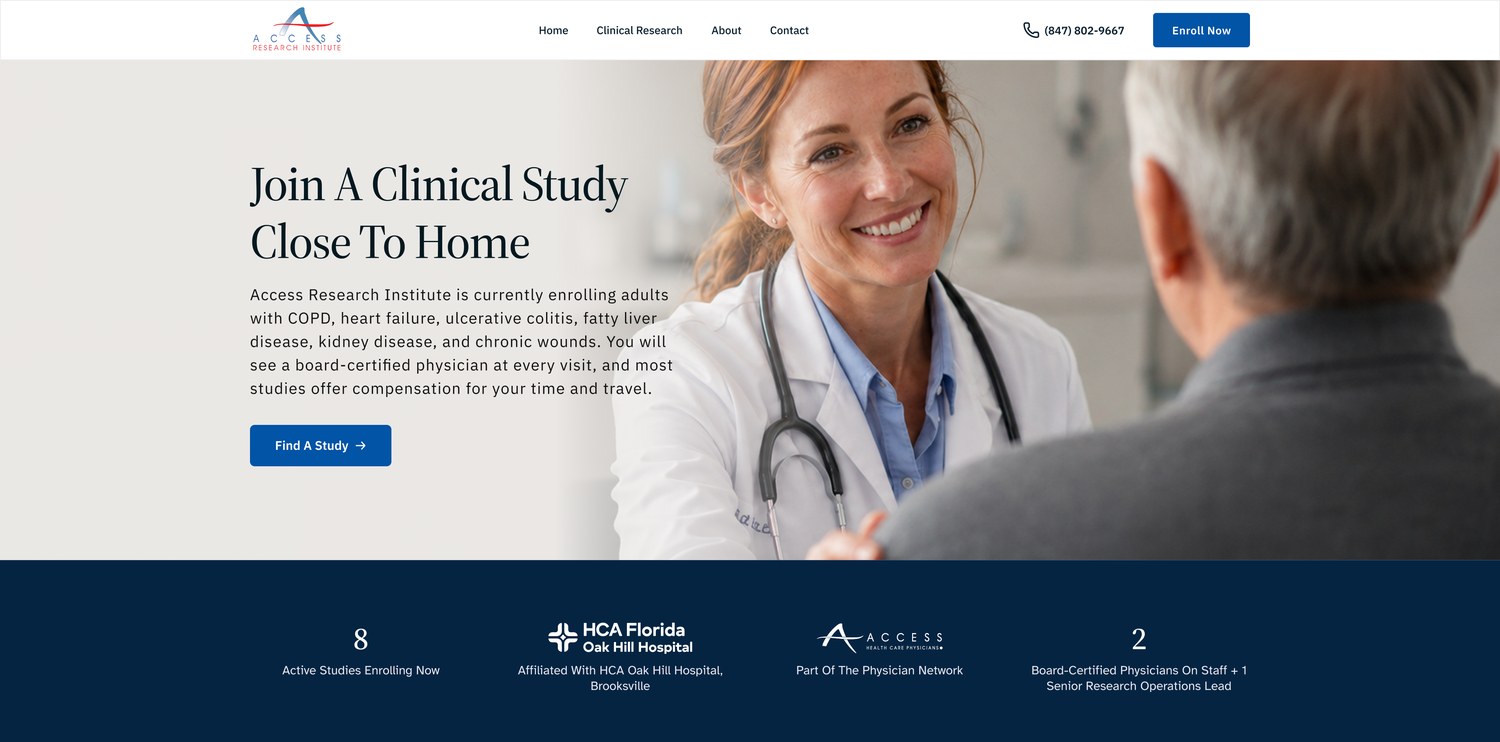
The redesigned homepage: Join A Clinical Study Close To Home, with the trust band naming HCA Oak Hill Hospital

The problem: a carousel hid 6 of 8 studies, unlabeled forms, no address anywhere.

What we did: all 8 templates redesigned around measured accessibility and governed tokens.

The result: a dev-ready file, every text pair AAA, 0 unlabeled fields, 56 interaction states.

One sentence steered everything

The brief named patients 60 to 75 and made accessibility the top priority, under one locked constraint: the network blue.

How the brief steered the work

ARI recruits participants for studies in COPD, heart failure, ulcerative colitis, liver disease, kidney disease, and chronic wounds. Nearly every visitor is a patient in their sixties or seventies, or an adult child researching on a parent's behalf. Visual cohesion with the Access Health Care Physicians network was a contractual requirement, not a preference; the blue is shared across every partner site.

Before any screens were designed, the current site was crawled and verified page by page. That pass produced a 30-question intake document for the client covering the public street address, IRB language, entity naming, and per-study accuracy. Several of those questions became the design decisions below.

Audience
Patients aged 60 to 75, and their adult children
Locked constraint
Network blue #0054A6 on every partner site

The site we started from

Captured live, August 2026; axe-scanned (WCAG A+AA) across six templates. Quotes verbatim.

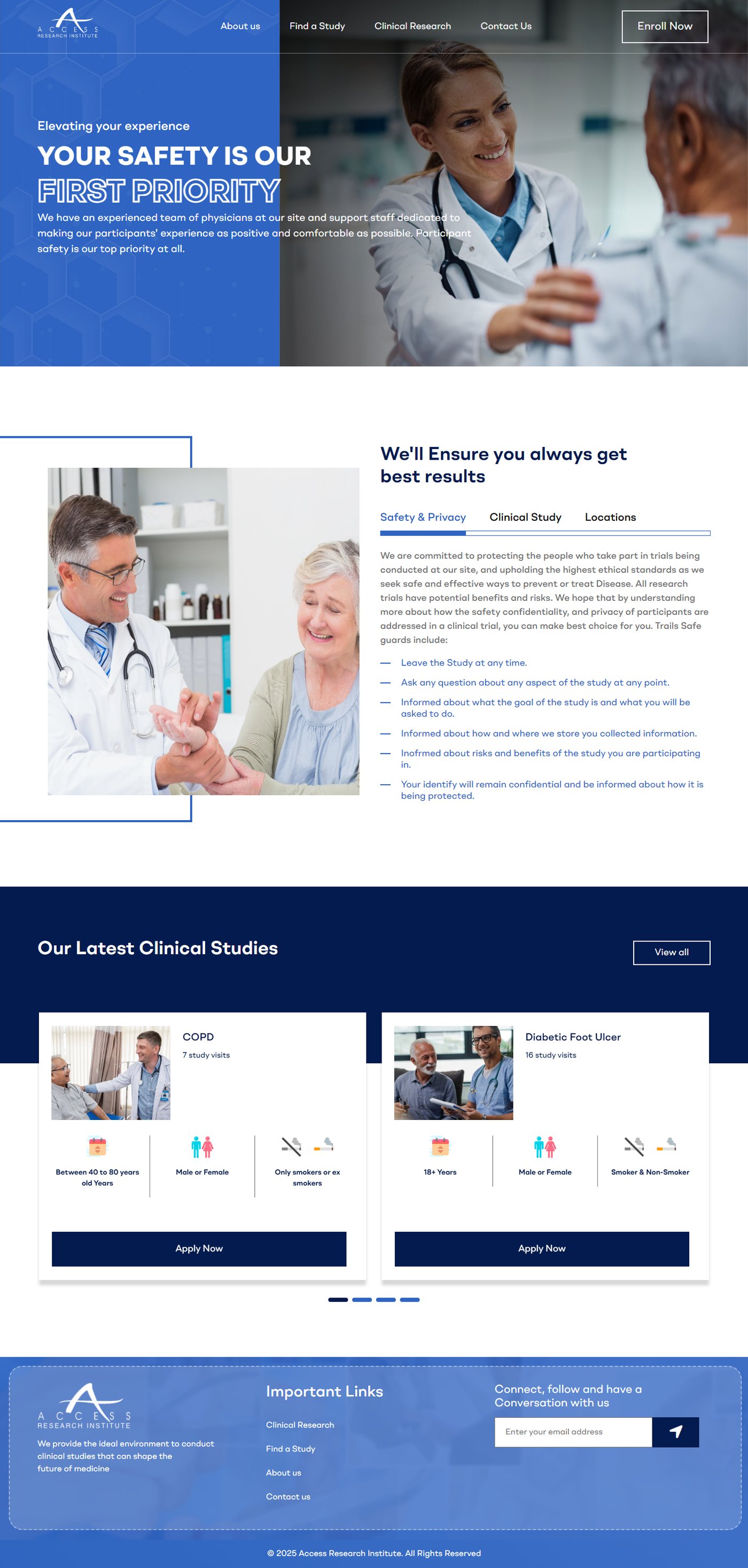
1 2 3 4 The previous Access Research Institute homepage, full page
Pins match the findings at right.
  1. The safety copy broke its own promise: Trails Safe guards include, Inofrmed about risks, Your identify will remain confidential.
  2. A carousel hid 6 of 8 studies; key content sat behind tabs.
  3. No street address, phone, or email anywhere.
  4. 12 unlabeled form controls on the study finder alone.
The fuller picture

The axe scan also found 16 focusable elements inside aria-hidden containers on the homepage. The old site was a reasonable template build undermined by details that matter enormously on a medical site. On a page asking for medical trust, typos are not cosmetic; for a 68-year-old visitor, content that must be operated (tabs, carousels) is content that gets missed. Eligibility criteria were drawn as pink and blue person icons and cigarette glyphs rather than words. A site asking patients to visit weekly never said where it was; the client intake document opened with exactly that question.

Decision one

The carousel became a catalog

Eight studies with distinct eligibility rules cannot live in a two-up carousel.

All 8 studies, visible.One filterable catalog, one governed template, one qualify modal.

Information architecture

Before After Home About us Clinical Research Contact us Find a study Services 8 orphan pages /single/copd /single/uc-iqvia /single/diabetic-food-ulcer /single/… five more no template, no empty state, closed studies 404 Home Find a Study Clinical Research About Contact Catalog + filters Study template ×8 Qualify modal Empty state closed studies redirect to condition content
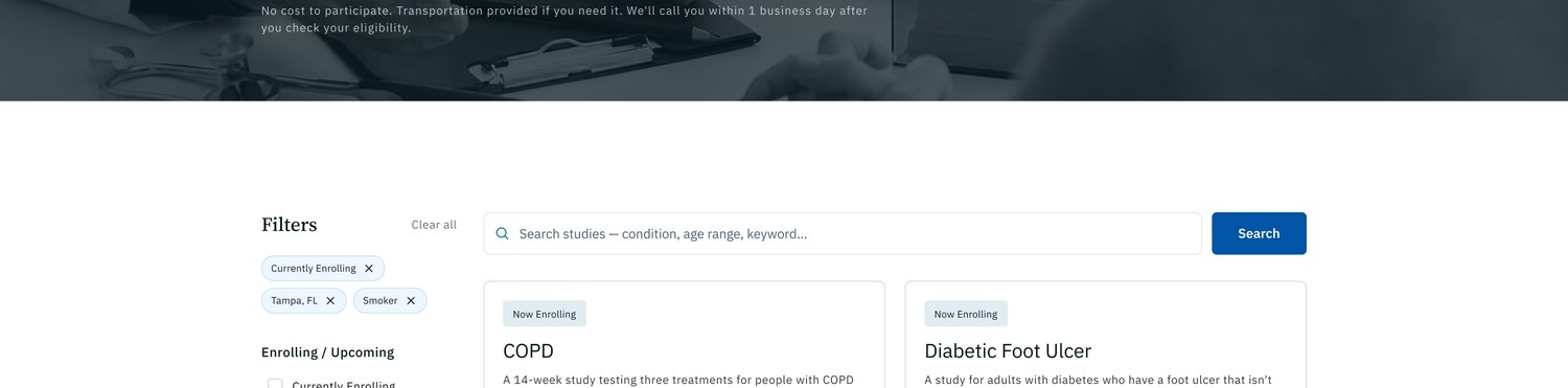
Catalog with filters: search, enrollment status, location, gender, smoking, compensation
Filters for status, location, gender, smoking, compensation.
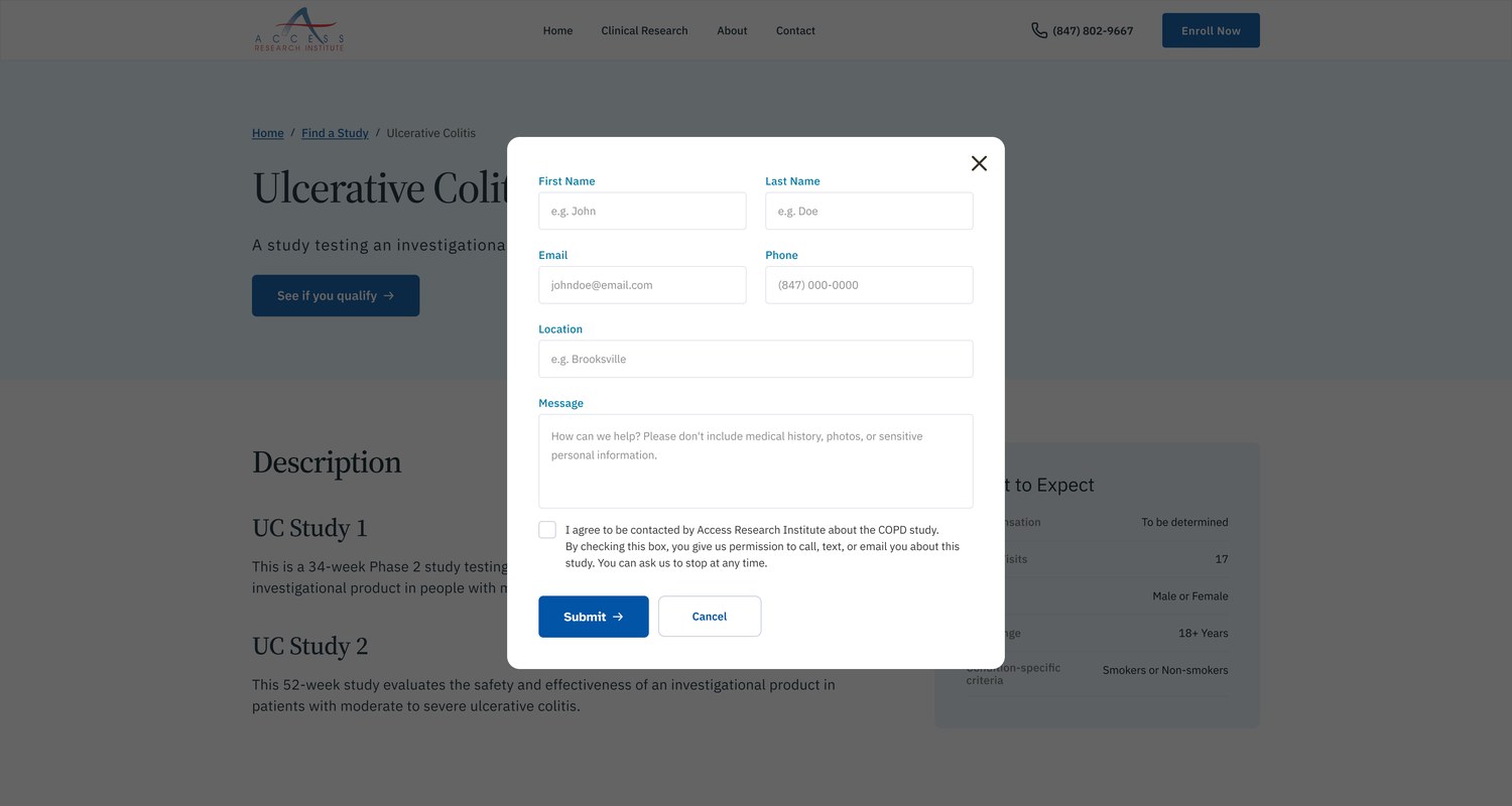
Study page with the See if you qualify modal open
Consent names the study; revocable.
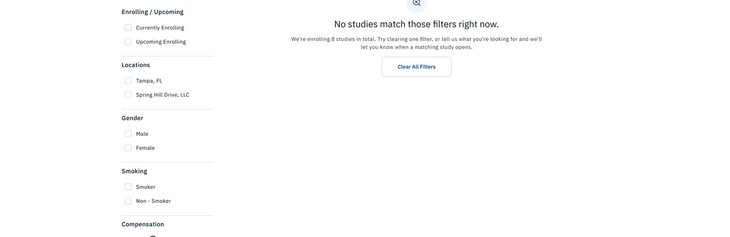
Find a Study empty state with a path back
The empty state is designed, not accidental. The old site had no equivalent.
Why not condition landing pages, and the closed-study rule

Condition-specific landing pages as the primary structure were rejected: sponsors add and close studies too often, so a catalog with one study template survives churn, and condition hubs can layer on later as content, not architecture. The study pages moved from eight hand-made orphan pages under /single/ to one governed template. When a study closes it stops silently 404ing; the intake document recommends redirecting closed studies to evergreen condition pages, which the template structure now supports.

Decision two

Accessibility as arithmetic, not intention

We treated accessibility as something to measure: static labels, hyperlegible fields, 44px tap targets.

7.45:1the locked network blue on white; the brand rule was the accessibility rule. 12 → 0unlabeled form fields, old vs new.
Measured contrast, new palette (WCAG 2.1)
PairRatioGrade
CTA blue on white7.45:1AAA
Navy headings on white9.28:1AAA
Body ink on paper11.21:1AAA
White on section navy11.74:1AAA
White on footer navy18.17:1AAA
Cerulean accents on white4.78:1AA
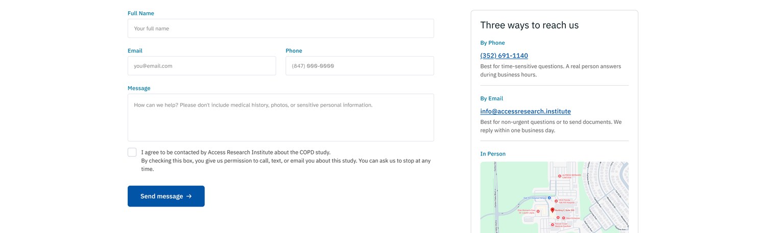
Contact form with static labels above fields and a plain-language consent checkbox
Static labels, hyperlegible fields, plain-language consent.
What the mobile pass actually changed

Nothing floats, nothing disappears on focus. The old finder's 12 unlabeled controls have no equivalent in the new system because labels are part of the field component, not a per-page courtesy. The documented mobile pass audited every interactive element to a 44px minimum tap target: footer links padded into full-width rows, filter checkboxes rebuilt, close icons enlarged. The smallest legal text moved from 11px to 12px. None of this is visible in a screenshot, which is rather the point.

Decision three

Trust is a content layer, not a tone of voice

The old site claimed safety; the redesign shows its work: the process, the address, the criteria, all stated up front.

The old site said

Access Research Institute is looking for medical research heroes to participate in clinical studies.
We'll Ensure you always get best results

The redesign says

Join A Clinical Study Close To Home
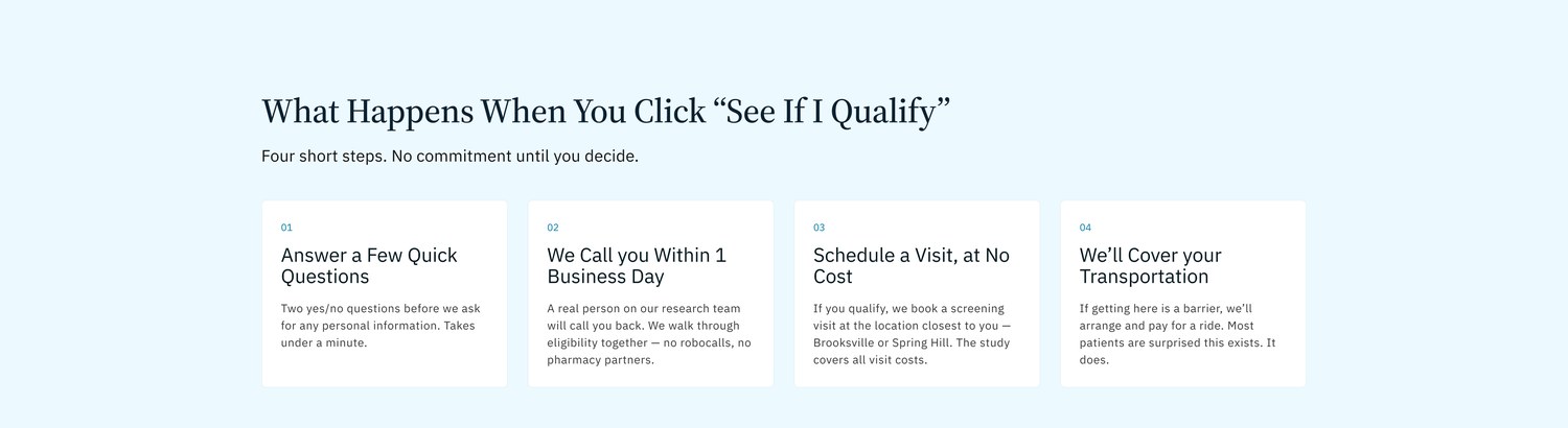
What Happens When You Click “See If I Qualify”
Four step section: answer a few quick questions, we call within one business day, schedule a visit at no cost, we cover transportation
Four steps between click and enrollment.
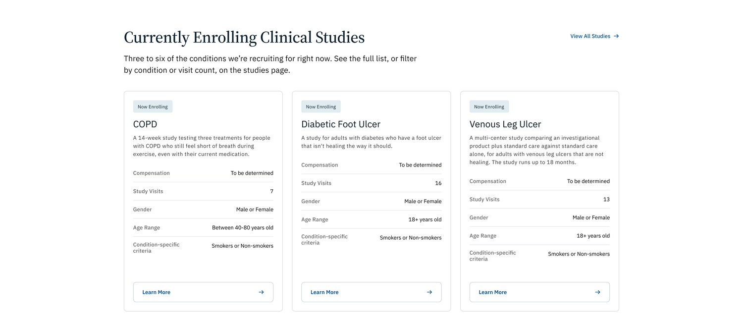
Study cards with criteria written as text: compensation, study visits, gender, age range, condition-specific criteria
Eligibility as sentences, not icon glyphs.
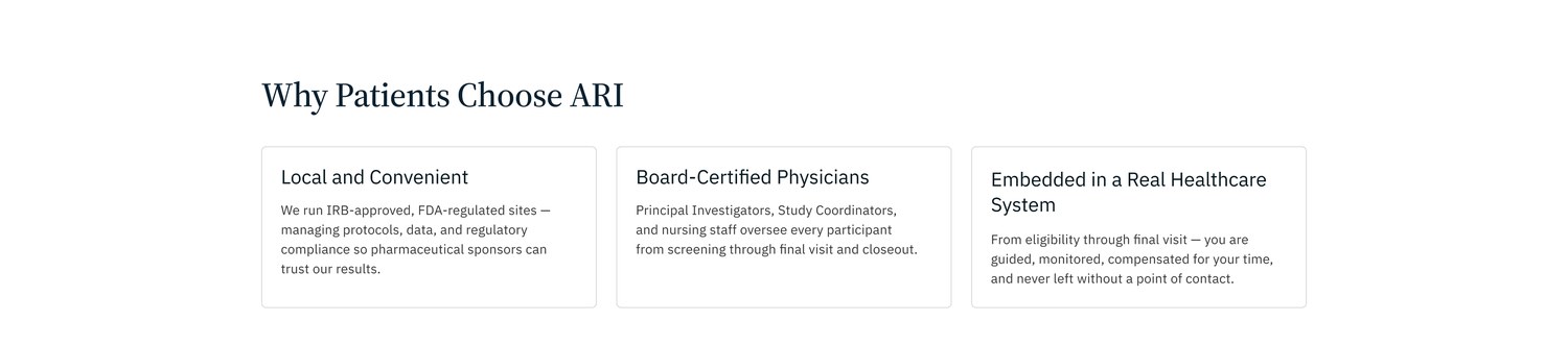
Why Patients Choose ARI: local and convenient, board-certified physicians, embedded in a real healthcare system
Plain reasons, no hype.
Compensation, entity naming, and the intake answers

Compensation that is not yet fixed says To be determined rather than promising anything. The footer carries the legal entity, Access Health Care Physicians, LLC, with HIPAA and accessibility notices, which also answers the entity question the client intake raised. The address, phone number, email, and business hours appear with a map on the homepage and again on the contact page.

Decision four

A file a developer can trust

56 states. 0 baked values.Not a picture of a website; a specification.
Primitives23 hidden color tokens, exact mockup hexes
Semantic17 alias-only tokens; a rebrand is a re-alias
Spacing + TypographyDesktop, tablet, mobile modes; type rescales automatically
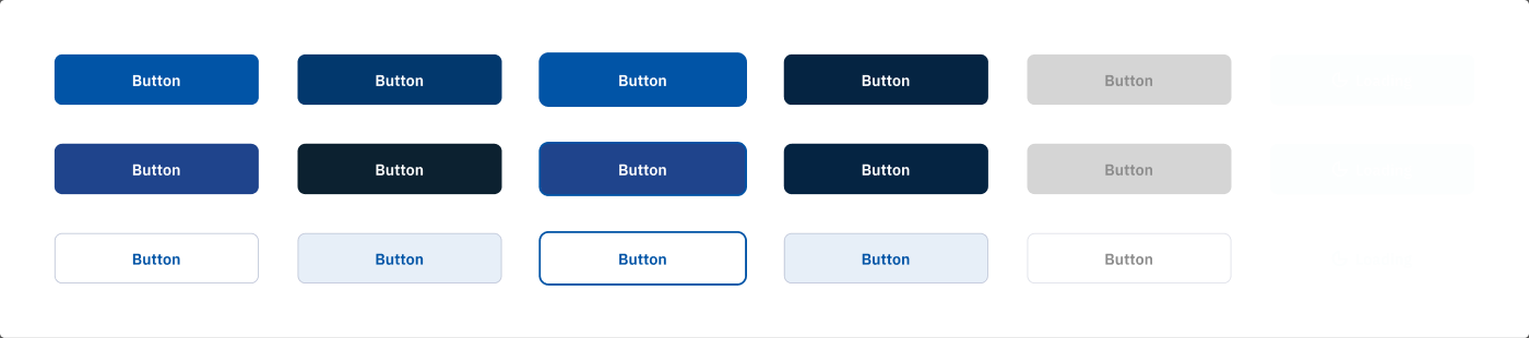
Interaction states7 component sets, 56 variants, every state bound to variables
Deviation logEvery contract departure written down, never silent drift
Button variant sheet: primary, secondary, ghost, across default, hover, focus, active, disabled, loading states Card variant sheet across default, hover, focus, active, selected states
Two of seven state sets: hover, focus, and disabled live in the file.

The mockups and art direction came from my collaborators. I owned what made them buildable: the Client-First restructure, variable architecture, responsive adaptation, and interaction states.

The annotation rounds

The responsive and accessibility passes ran through five batches of dev-mode annotations left by the designers, each batch resolved to zero before the next: reflowed footers, a filter panel reworked into a drawer, a modal rebuilt as a bottom sheet, tap targets padded to 44px, and a detach ledger recording every component that had to leave the update chain to get there.

Illustrative research and process

Who the decisions were tested against

Reconstructed to document reasoning, not field research.

Three personas and six user stories, mapped to shipped features

Evelyn

68 · COPD, ten years · low tech confidence

Manages COPD and wants options beyond her current medication. Relies on her daughter for anything involving forms on the internet.

  • Needs each step spelled out before she commits
  • Will not type her medical history into a website
  • Reads everything twice; small gray text loses her

Michael

45 · researching for his mother · heart failure

Does the internet work for his 71-year-old mother. Skeptical by default and cross-checks anything a site claims against her cardiologist.

  • Filters by condition first, reads criteria second
  • Wants a phone number that a person answers
  • Checks who runs the site and where it physically is

Harold

72 · completed a previous UC study

Has done a study before and would do another. Impatient with sites that make him hunt for what changed since last time.

  • Goes straight to the catalog, skips the pitch
  • Wants enrollment status without calling to ask
  • Would opt into rare, low-volume email updates

Stories, and where the design answers them

As Evelyn, I want to see what happens after I click, so that I can decide before anything is asked of me.
The four-step qualify section, and a modal consent line she can revoke.
As Evelyn, I want forms I can read, so that I do not need my daughter on the phone to finish one.
Static labels, Atkinson Hyperlegible fields, a placeholder that says what not to include.
As Michael, I want to filter studies by my mother's condition, so that I can shortlist in one sitting.
The catalog's filter panel: status, location, gender, smoking, compensation, plus search.
As Michael, I want to know exactly who and where this organization is, so that I can verify it independently.
Address, phone, hours, and map on the homepage; the legal entity in the footer.
As Harold, I want enrollment status on every study, so that I do not chase closed trials.
Now Enrolling tags, an enrollment filter, and closed studies that redirect.
As Harold, I want occasional updates when new studies open, so that I do not have to keep checking.
The footer signup states its terms: two or three emails a year, no marketing partners.
Where it stands

Development-ready in Figma, not yet shipped; no numbers invented. Measured in the file:

8

desktop templates, plus tablet and mobile adaptations

AAA

every primary text pair, 7.45:1 to 18.17:1

0 / 12

unlabeled fields, new finder vs old

44px

minimum tap targets, all 9 mobile frames

56

interaction-state variants, 7 component sets

30

intake questions: address, IRB language, accuracy

The honest caveat

The old site's study detail pages scanned clean in the same axe pass that faulted the homepage and finder, so the redesign's case does not rest on the old site failing everything. It rests on the audience definition: for readers in their sixties and seventies, carousels, icon-glyph criteria, and 11px legalese are exclusion mechanisms even where automated rules pass.

What working on it taught me

One brief sentence, audience 60 to 70, accessibility first, settled every argument. The other lesson: systemization is design.

Maria Angelika AgutayaWorkflow Engineer · mariaangelika.com · Designed with collaborators for Access Research Institute, 2026