Maria Angelika Agutaya · case study8bitfiction, 2026
A gallery that moves the way the art is made
Client8bitfiction (Patrick, pixel artist and flash-fiction writer)My partDesign, build, cross-device QA, deployTeamSoloStatusLive at 8bit-demo-2.vercel.app
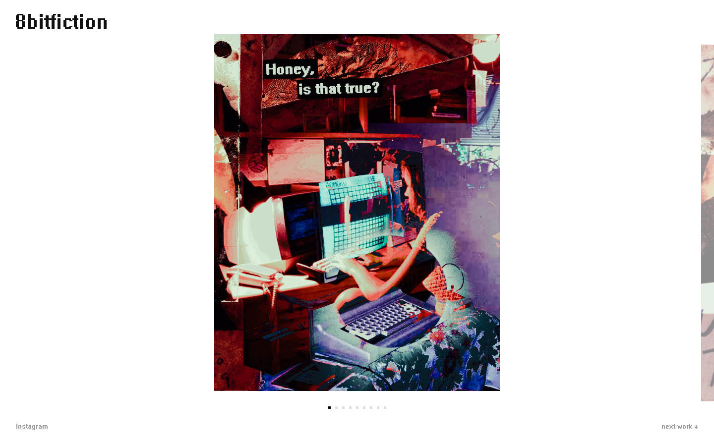
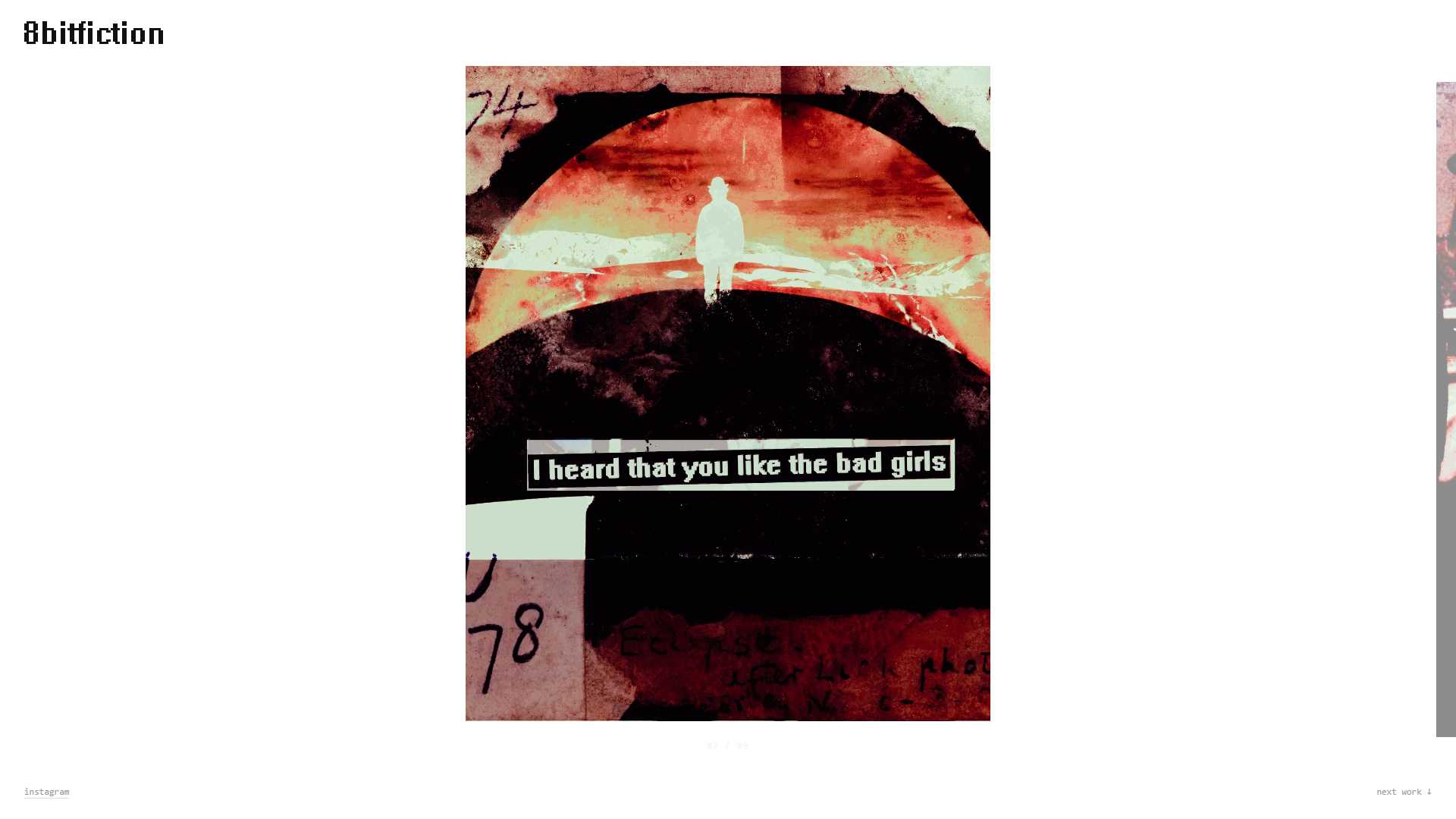
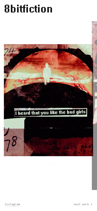
The live site. Wordmark, white page, the art in the middle, and almost nothing else.
The brief: the artist asked for a logo, a white page, and the latest art in the middle. Nothing else earned a place.
What I built: a one-page canvas gallery where each work dissolves into the next, pixel by pixel, in the art's own grammar.
The proof: live on Vercel, a 74-capture cross-device matrix, zero 404s in the live QA pass.
the assignment
The whole brief fit in one sentence
“Logo, white page, latest art in the middle. The simpler, the cleaner, the better. Art can take as much space as it can.”
8bitfiction is melancholic flash fiction set inside 8-bit pixel collages. The fiction is baked into the images, so the site could add no captions and no text overlays, ever. The page's only job was to hold the art and get out of the way.
What that sentence deleted
Before this brief there was a much bigger concept: a drifting archive built on 60 pieces pulled from the artist's Instagram, an infinite camera flight through a depth field of cards, glitch interludes, a ticker of first lines. It was elaborate and it was wrong for him. When Patrick became a real stakeholder his one sentence replaced all of it, and the scope locked to the newest drop only: 13 works, no CMS, no back-catalog. I redeploy when new art ships.
Three direction mockups went to the pick: a plain white gallery, a pixel-dissolve concept, and a feed-style layout. All three were QA'd headless before the choice. The pixel-dissolve direction won, paired with an edge peek for the set.
Works
13 pieces: 9 portrait (2160 by 2700) and 4 wide (1490 by 775)
Hard rule
The fiction lives inside the art; the site adds no captions
Stack
Static HTML, canvas rendering, Vercel
Wordmark
Patrick's logo, reverse-engineered to a 61 by 10 pixel grid
decision one
Draw the transition in the artist's medium
A default CSS fade smooths the edges the whole practice is about. So the transition is drawn on canvas instead: one piece resolves into the next as individual pixels, the same grammar the artist works in.
Medium-truethe transition is made of the same pixels as the art. It stops being chrome around the gallery and becomes another instance of the work.
Why the harder version
The canvas route is more work and more fragile than a CSS fade. Canvas rendering behaves differently across devices, so the effect that looked right on a laptop had to be checked against a full capture matrix before the claim could be made. That verification pass is decision four below. The trade was accepted because the fade quietly contradicts the art it presents, and for a pixel artist the moment between works is part of the show.
decision two
Chrome is a signal, not decoration
Only the portrait series is a set; every wide piece stands alone. So set chrome itself carries meaning: if you see dots and an edge peek, you are inside a set. Standalone works show zero chrome.
An earlier build, same day: a faint position fraction under the art.Overruled the same day: square dots, 5px, clickable, no fraction anywhere.
Dots, not a fractionSeven indicator variants were tested side by side. The fraction was built first and lost: a numeral reads as interface, dots read as pixels.
Edge peekThe next piece in the set shows as a sliver at the right edge. Its presence, like the dots, tells you a set exists.
No wheel navigationScroll originally moved between works. Cut: scrolling should never carry hidden functionality. Navigation is keyboard arrows, the next-work link, dot clicks, peek clicks, and touch swipes.
decision three
The interface font is the font inside the art
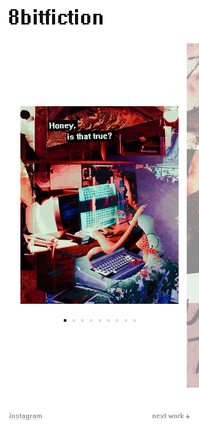
Patrick sets his fiction captions in System, the defunct Windows 3.x raster face. The site's two labels are rendered in that exact font, rebuilt glyph by glyph, so even the interface text belongs to the work.
14 glyphsextracted straight from the original raster font at its native 16px em, re-encoded as JavaScript pixel grids. No Microsoft font file ships.
How the extraction worked
Modern text stacks silently substitute raster fonts, so the glyphs had to come from raw GDI: create the System font, render each character to a bitmap, and read the pixels back. Row lengths use the true advances with bearings. Only the characters the two labels need shipped, the letters of “next work” and “instagram” plus a down arrow, which the raster font never had, so it was drawn by hand to match the System weight. The labels keep real anchor elements and aria-labels underneath; the pixels use currentColor so hover styles still work.
Mobile, live. The corner labels are the rebuilt System glyphs at their native size.
decision four
The claim had to survive real devices
Canvas effects lie on the machine they were built on. Before calling it done, the build ran a full cross-device matrix: iPhone SE and 14 Pro in both orientations, Pixel 7, iPad both ways, and flat widths from 1280 to 2560, on both the Chromium and WebKit engines.
74 capturesthe cross-device matrix the effect had to pass, rerunnable against any URL.0 404sin the live QA pass after deploy.
From the device matrix. The art caps its own width so the edge peek always keeps a clear gutter.What the matrix actually caught
iOS URL-bar jumps: viewport heights moved to dvh units.
Peek collisions on phones: mobile art is capped at the viewport width minus 80px, so the peek keeps a 16px gutter.
Landscape phones: a max-height query scales the wordmark down and holds the art at 68dvh.
Tap targets: the 5px dots carry invisible 21px hit areas.
Scroll chaining: overscroll-behavior none, so swipes never bounce the page.
this page, same rules
The case study borrows the site's own palette
White ground, near-black ink, square dots, mono text. The site's own gray labels sit below contrast thresholds, so this page darkens them; every text pair here measures AAA.
Measured contrast on this page (WCAG 2.1)
Pair
Ratio
Grade
Ink on white
18.88:1
AAA
Muted text on white
7.46:1
AAA
White on the dark bands
18.88:1
AAA
Muted text on the dark bands
9.21:1
AAA
where it stands
Live, verified, and honestly unfinished
13
works on the page: one 9-piece portrait set, 4 standalone wides
74
captures in the cross-device matrix behind the "it works everywhere" claim
1 page
a single tight gallery, no navigation to get lost in
61 x 10
the pixel grid the wordmark was reverse-engineered to
14
System-font glyphs extracted and re-encoded as pixel grids
0
captions added to the art, per the hardest rule in the brief
The honest caveat
The dissolve runs a fixed duration, so a dense piece and a sparse one resolve in the same beat even though the eye needs longer on the busy one. The fix I would ship next ties transition length to the visual complexity of the outgoing frame. Also still open: the hero ordering assumes newest first and is not yet confirmed with Patrick, and the planned move from the hand-built bundle to a proper static build has not happened. The art and the 8bitfiction name are the artist's; this is client work, not mine to relicense.
What working on it taught me
The strongest design system on this project was one sentence from the artist. Every later decision, dots over a fraction, no wheel, no captions, a font pulled out of Windows 3, was just that sentence applied again. Restraint is not the absence of decisions; it is more of them.
Maria Angelika Agutayamariaangelika.com · Built solo for 8bitfiction, 2026